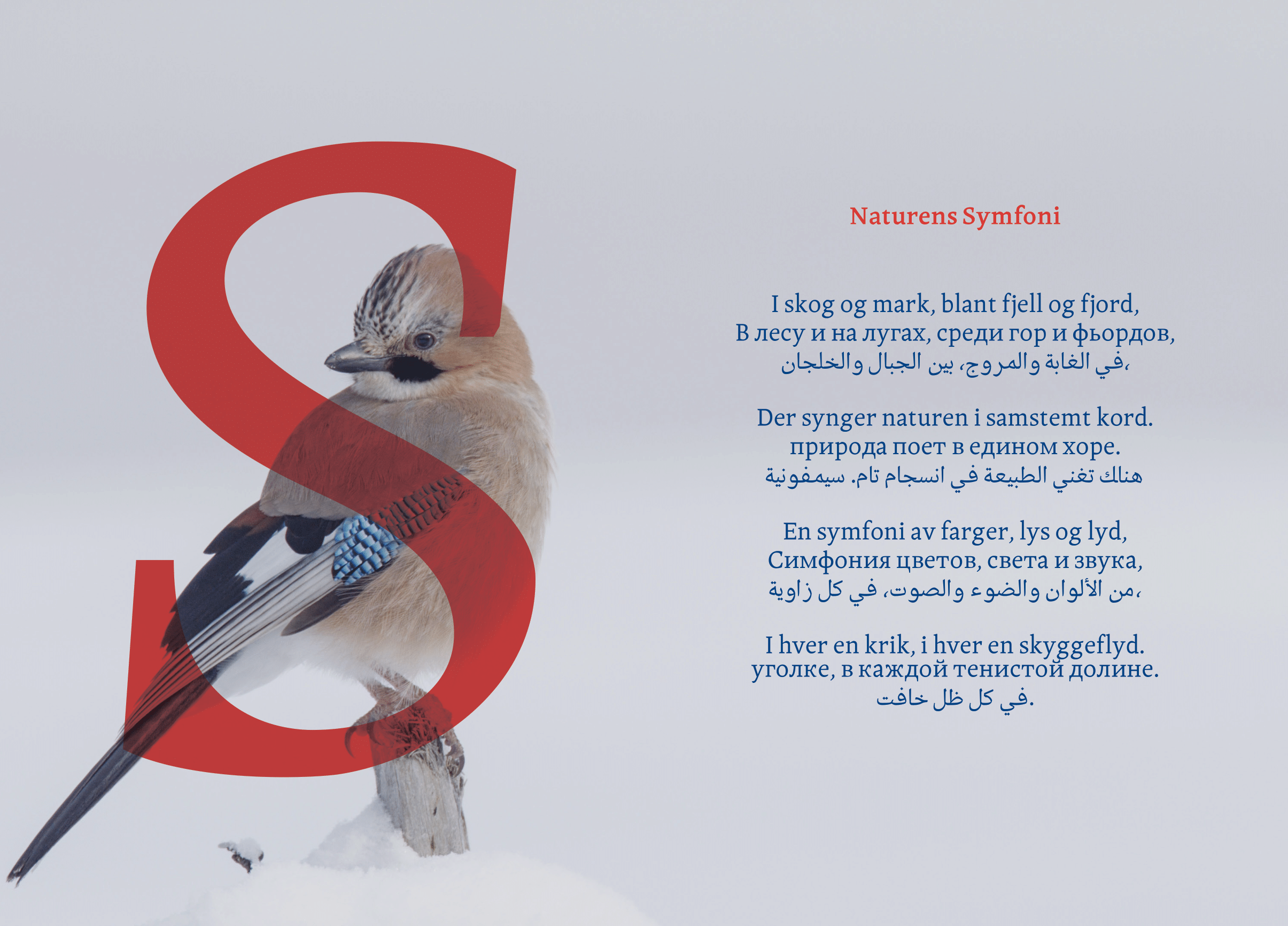
Skandi | Jostein Aasbø
Skandi is a multiscript typeface inspired by Scandinavian architecture, traditional clothing, and cultural elements from Norway, Sweden, and Denmark. Skandi features a distinctive low contrast, which enhances its readability and versatility across mediums. With a tall x-height, Skandi works even in smaller text sizes while remaining clear and legible, making it an excellent choice for printed mediums.
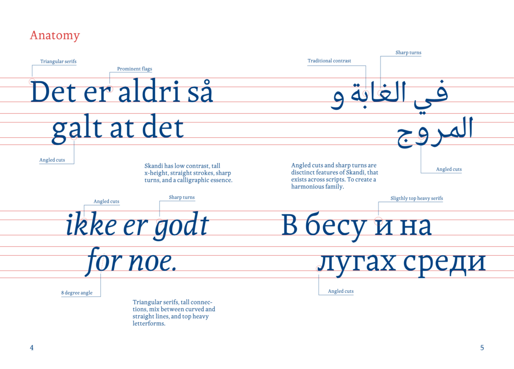

The design of Skandi incorporates straight strokes and sharp turns, which reminds of the clean lines and minimalist aesthetic often found in Scandinavian design. This combination of straight strokes and sharp turns not only adds a modern touch but also reflects the calligraphic constructions that gives Skandi its unique character. The angular cuts and triangular serifs are particularly striking, adding a touch of sophistication and elegance to the overall design.
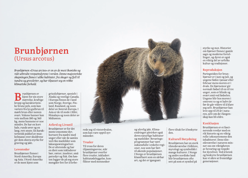
Skandi’s blend of curved and straight lines creates a harmonious and comfortable reading experience. The balance between these elements ensures that the typeface is both visually appealing and functional. The curved shapes soften the rigidity of the straight strokes, making Skandi feel approachable and friendly, while the straight strokes and angled cuts maintain a sense of structure and order.
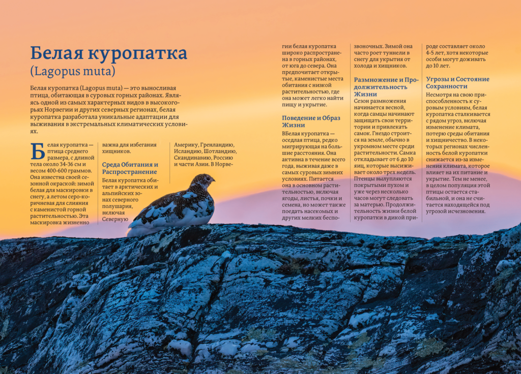
The making of Skandi involved research and iterative refinement. I researched Scandinavian architecture and traditional clothing to gather inspiration for the typeface’s unique features. Analysing various cultural elements from Norway, Sweden, and Denmark to ensure that the typeface accurately reflects the essence of Scandinavian design.
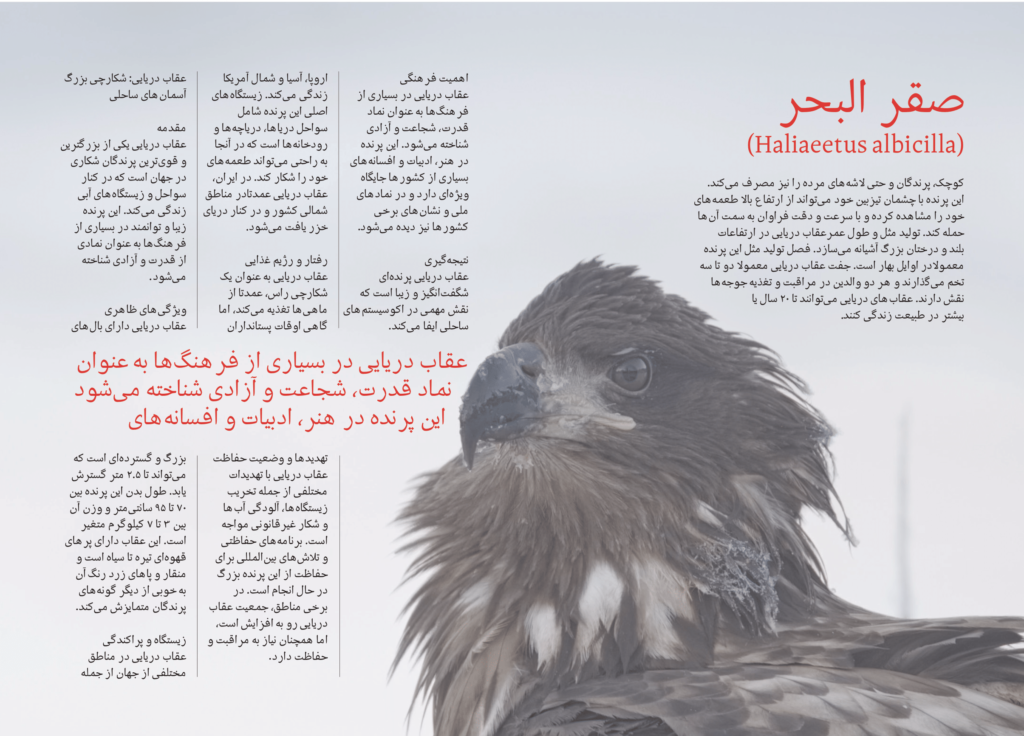
Throughout the development process, I made numerous adjustments to ensure that Skandi achieved the perfect balance between aesthetics and functionality. After input from many professionals in the field Skandi turned into a well-balanced and legible typeface suited for a wide range of applications. Skandi is well-suited for governmental and corporate use, where clarity and professionalism are paramount, and also thrives in magazines and tourism adverts. Its clean lines and sophisticated design convey a sense of trust and reliability, making it an excellent choice for official documents and branding materials. The typeface’s versatility also makes it suitable for use in advertising and editorial design where readability and visual appeal are crucial.
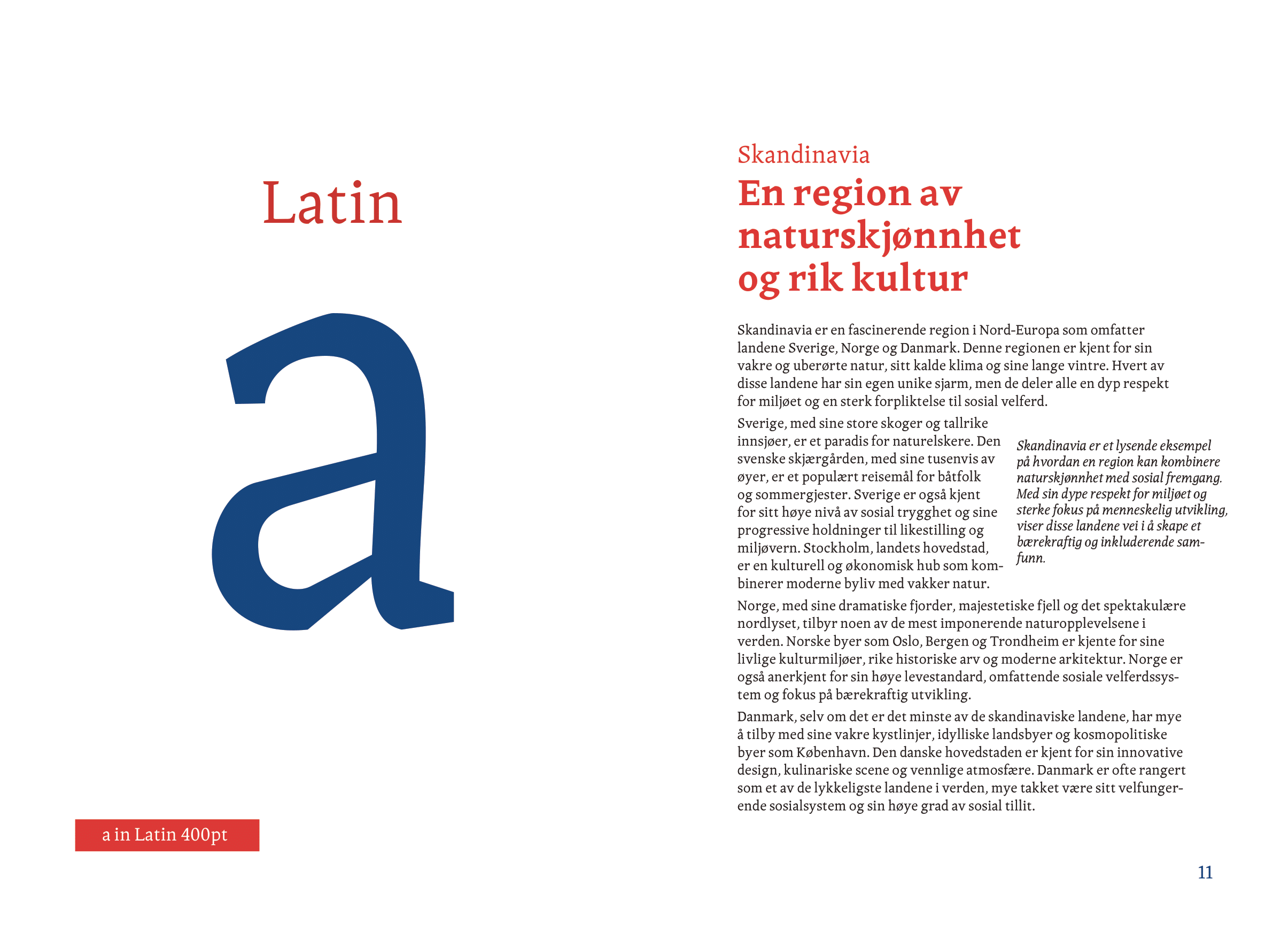
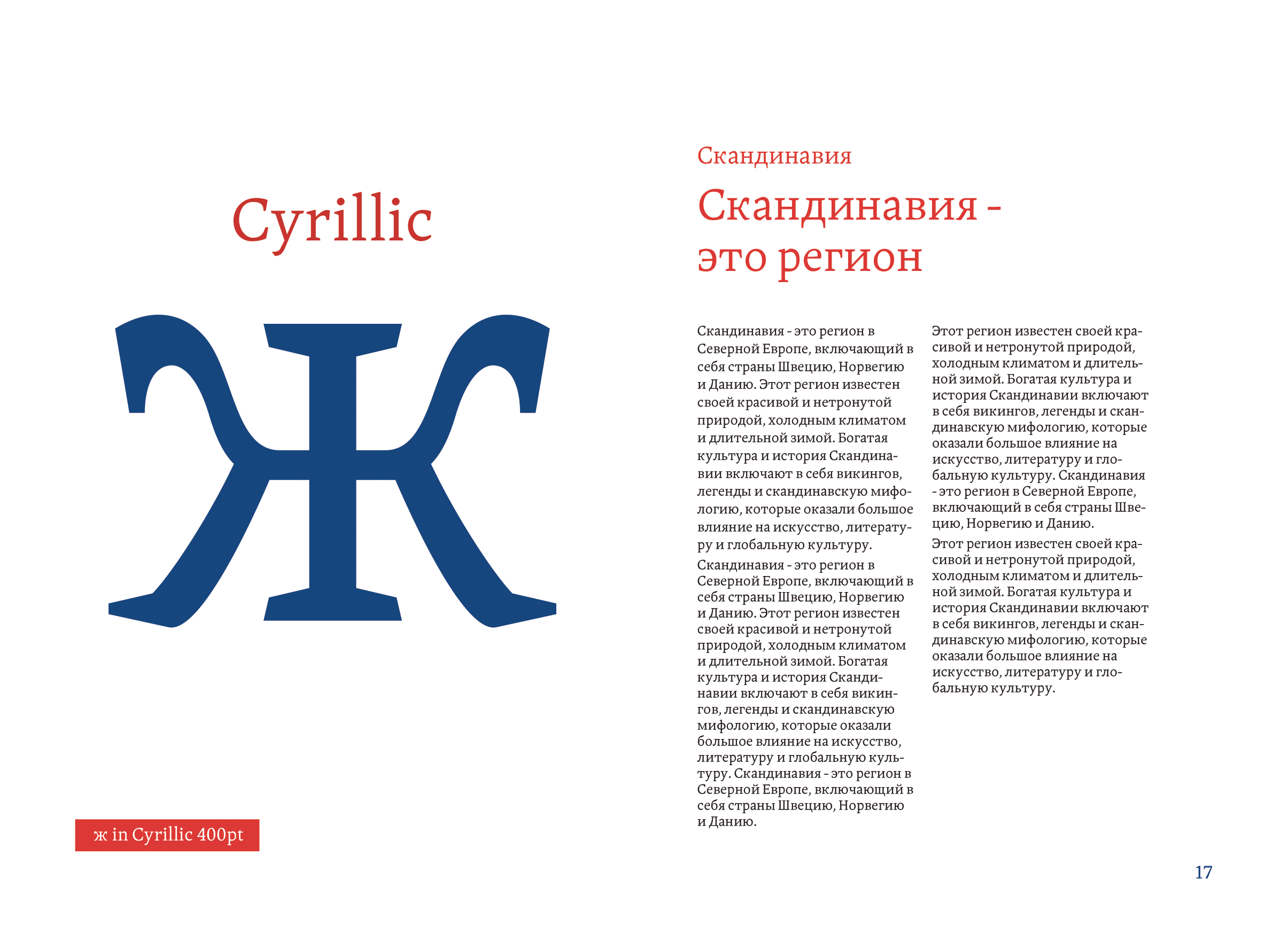
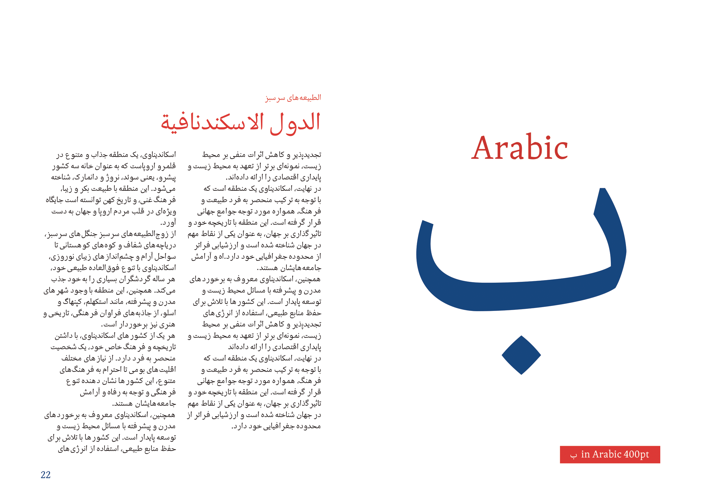
In summary, Skandi is a typeface that mixes the traditional with the modern, drawing inspiration from the rich cultural heritage of Scandinavia while incorporating contemporary design principles. Its low contrast, tall x-height, and distinctive features make it a versatile and a highly legible typeface suitable for a wide range of applications. With support for multiple scripts and plans for further expansion, Skandi is ideal for designers and typographers seeking a blend of elegance, functionality, and cultural authenticity.