Mamut | Josse Pickard
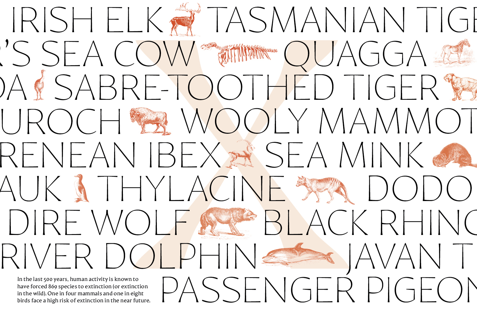
Mamut styles itself as an atypical text face, throwing off the shackles of the garaldes of yore.
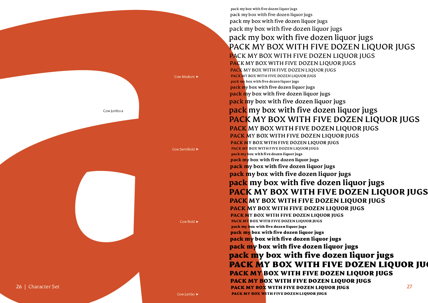
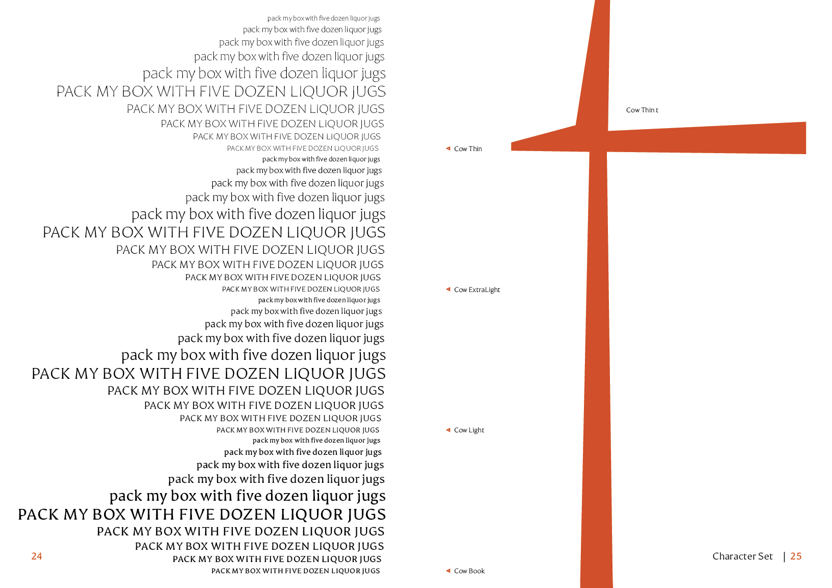
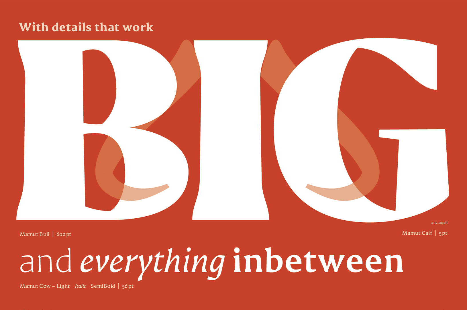
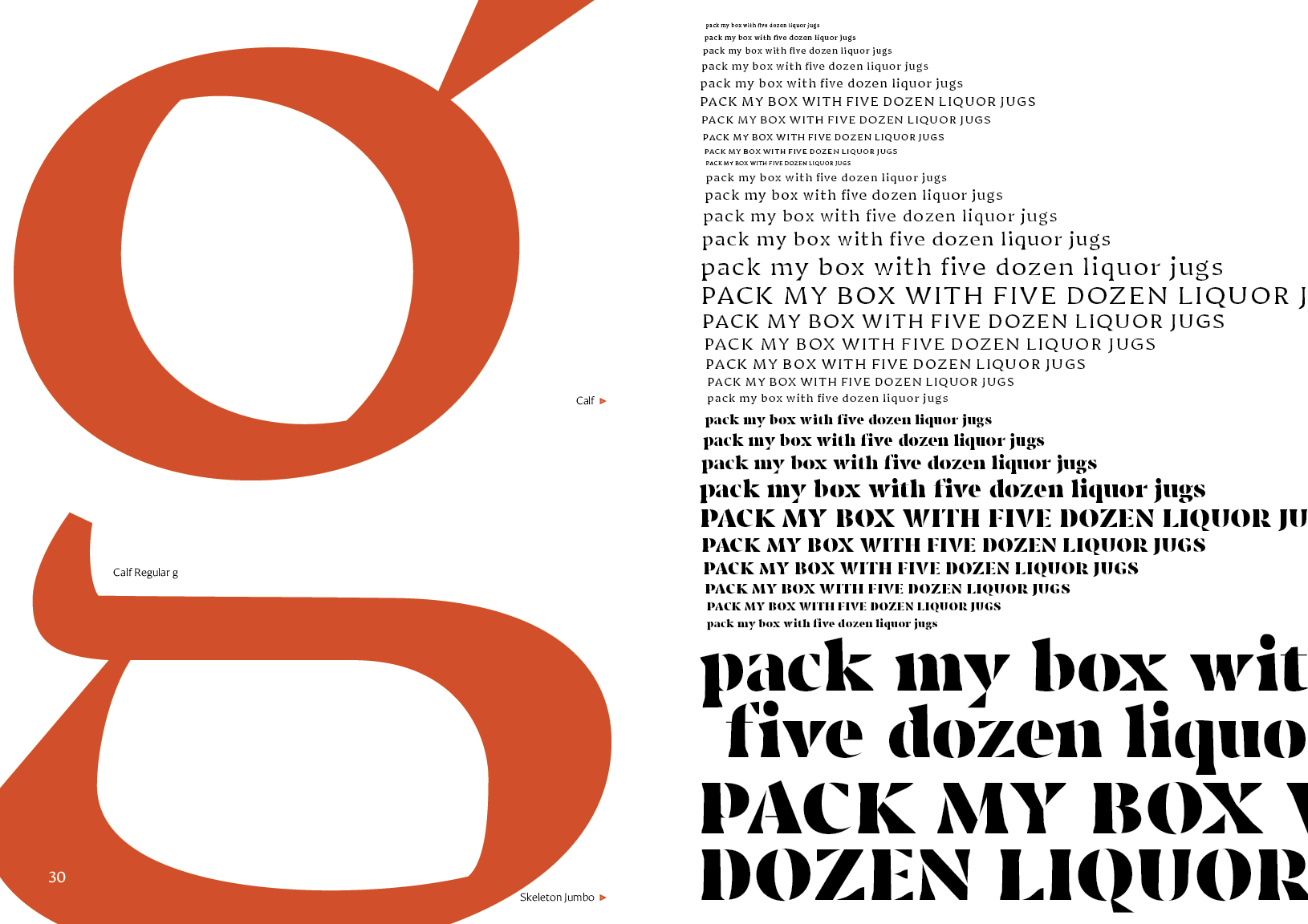
The text-weight, Cow, has been designed with microsizes in mind; a large x-height, big counters and distinctive dwigginsian cuts to maximise the amount of white space inside the form. The elephantine serifs which give the typeface its name were made with component corners allowing them to contort across the different sizes and weights dependant on use case. This is especially helpful for the micro size, Calf, designed for 5pt or lower. In this weight the forms are pushed to their extremes, taking whatever steps necessary to reach legible outcomes.
While the text weights have a pleasant airiness to them, Bull ExtraBold or Skeleton are perfect for those times you really want to kick up a fuss. A perfect alternative for the designer who’s bored of the status quo.
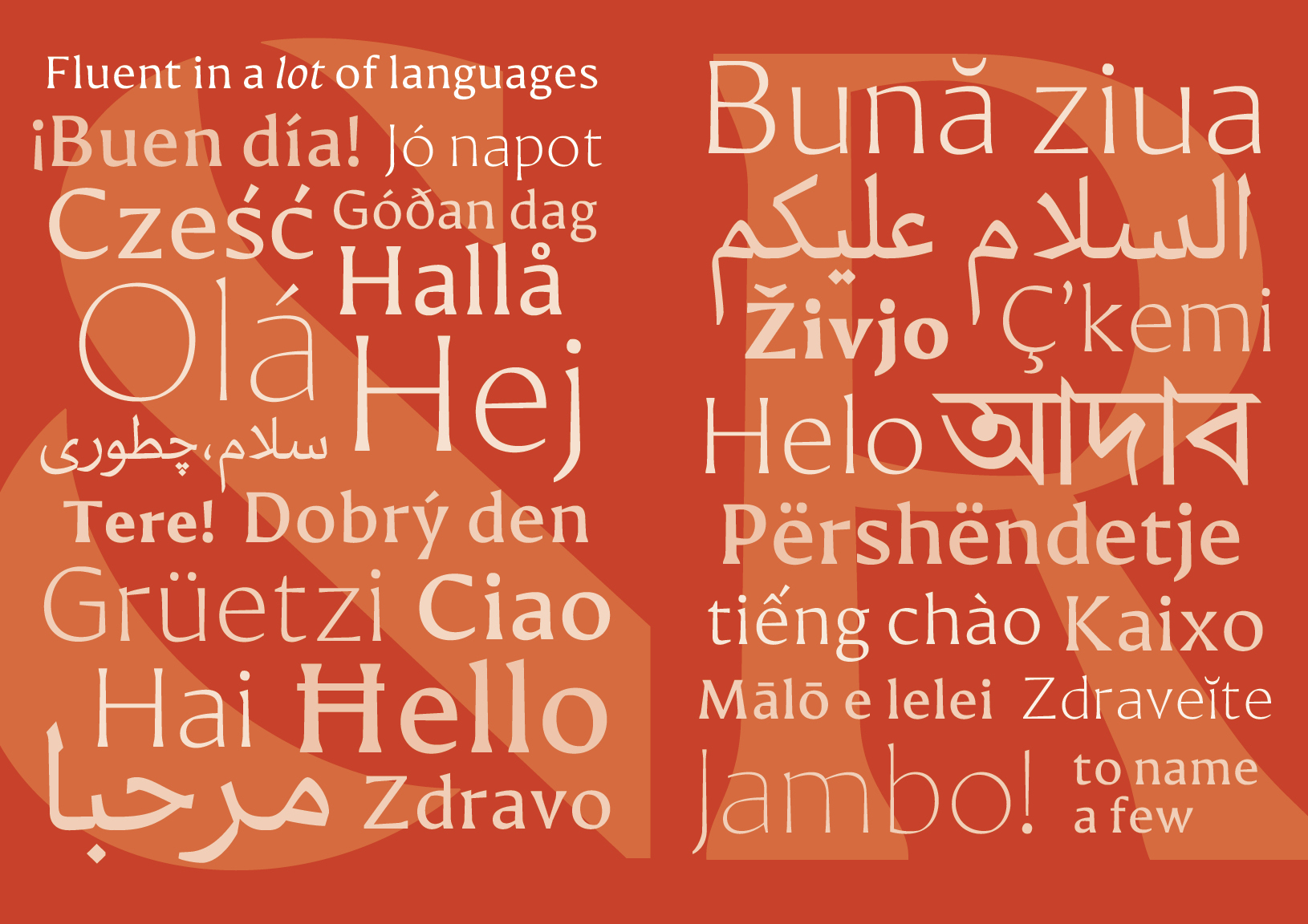
Mamut is a polyglot with support for three scripts, Arabic, Bengali and Latin, and over forty languages.
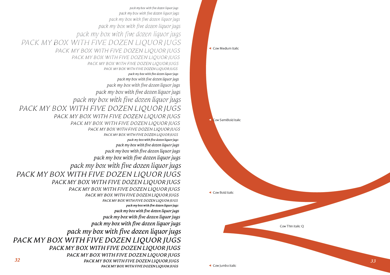
The Latin is a multitasker, packed with everything you’ll ever need; eight weights with italic and small caps for them all; lining, titling and old style figures, the full spectrum of punctuation and an ever increasing range of diacritics with plenty of typographic ephemera to boot.
The Arabic and the Bengali will eventually match the weight count of the latin though currently this is only the case for the text weight of the Arabic. A secondary style has been sketched for both the Arabic and Bengali for use in typographic emergencies though this is not yet completed. A complete set of ligatures is included with the Arabic so you don’t have to worry about spacing faux pas.
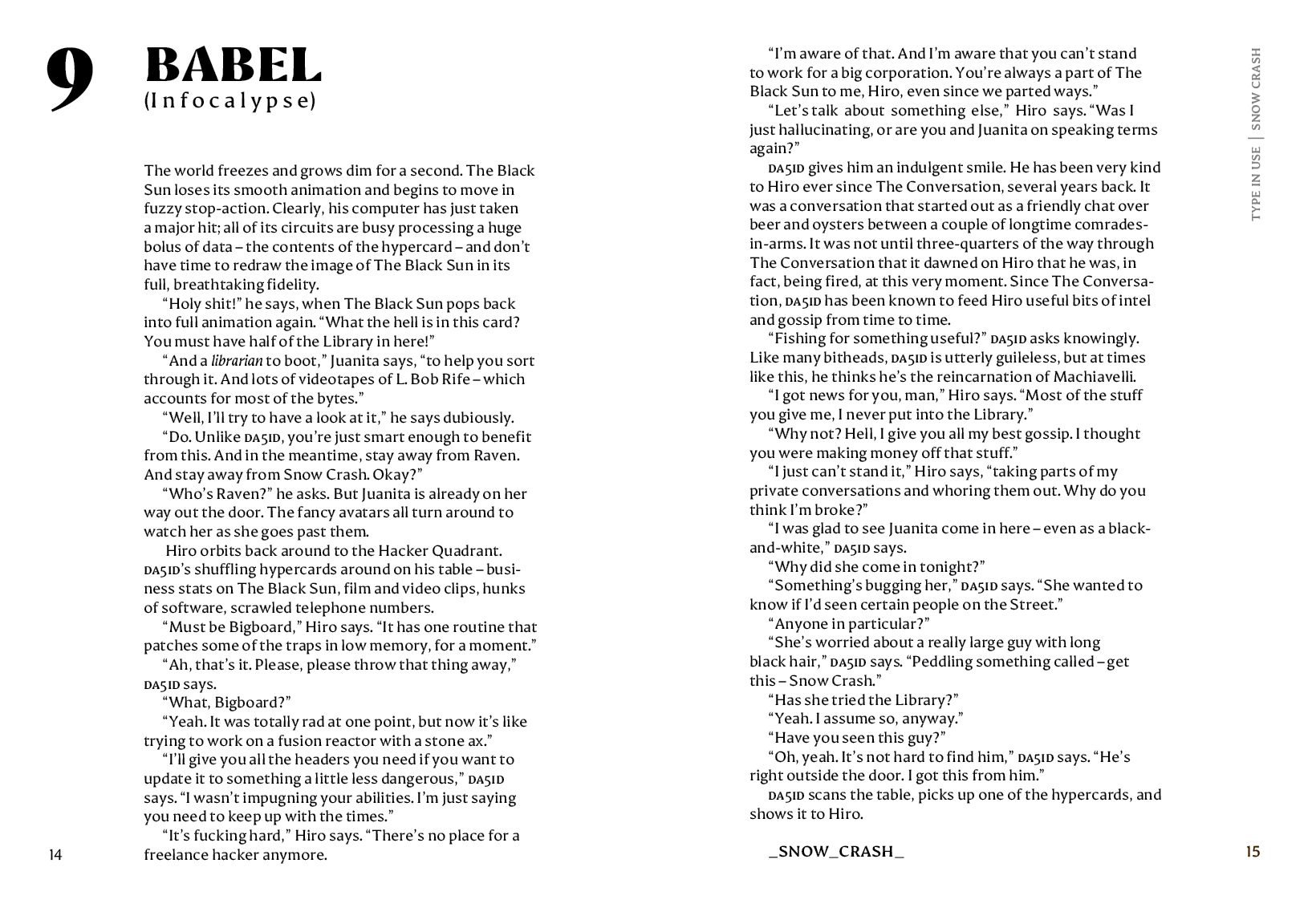
The typeface has myriad influences, we can see Wolpelike forms and Ungerian principles. The forms will fit anywhere you would use a Garalde, though it is the antithesis of these. The human hand is present but the remnants of the past are long forgotten.
