Flo | Zofia Oslislo
Flo is a new typeface family that aims to revolutionise early education in Poland. Designed by a passionate typographer, Flo addresses the pressing problem of ineffective handwriting models and the disconnect between reading and writing in Polish elementary schools. With its unique features and progressive learning approach, Flo promises to make the journey of learning to read and write more accessible and enjoyable for young learners.
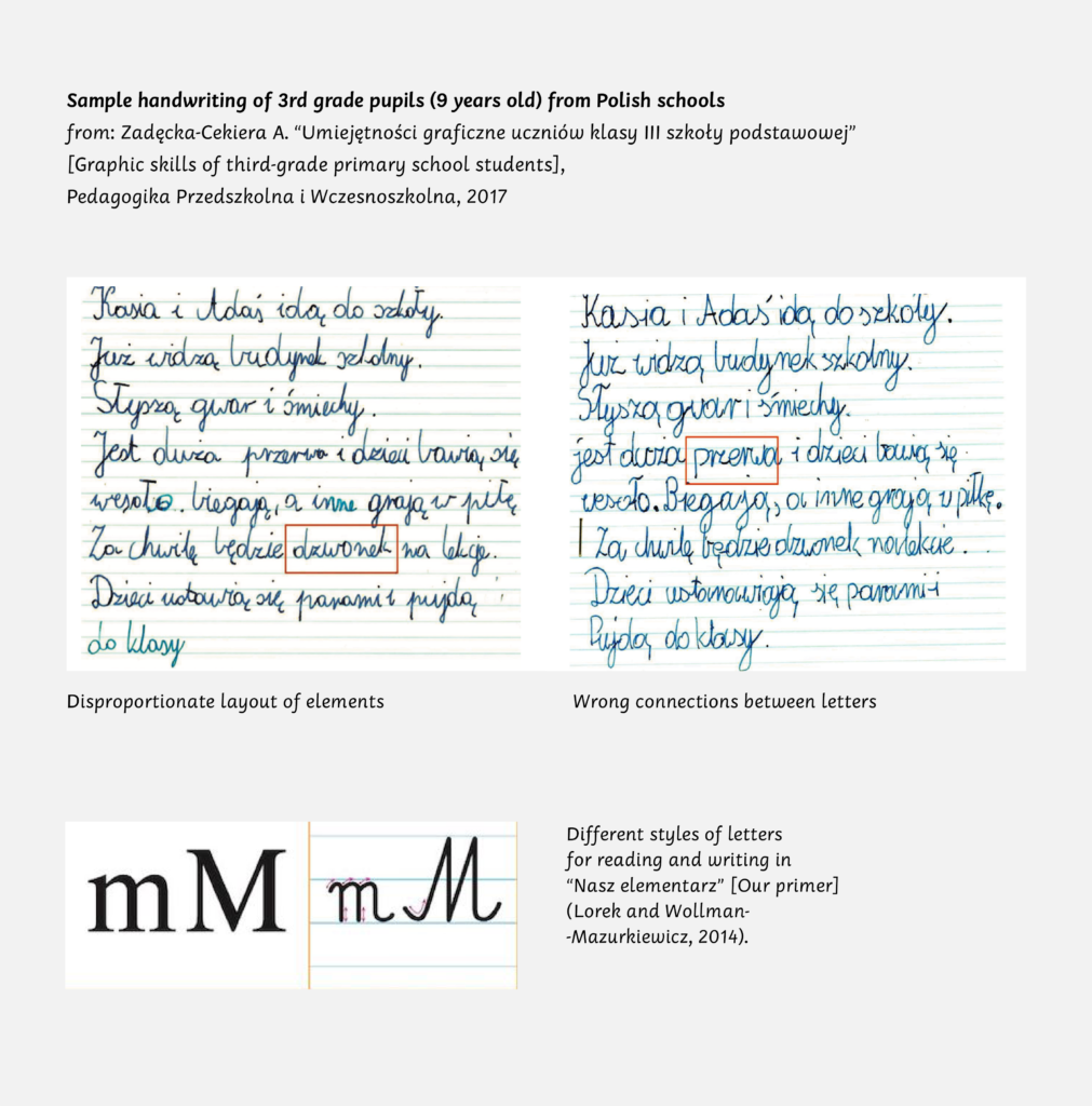
Flo was born out of the designer’s observation of the challenges faced by Polish early elementary students. The existing handwriting model proved to be ineffective, leading to a lack of legible and efficient handwriting after three years of training. Moreover, the reading model, a classical serif typeface, had completely different shapes, forcing children to learn two alphabets simultaneously. Inspired by Rosemary Sasoon’s research and contemporary handwriting models, Zofia Oslislo set out to create a tailored solution for the Polish language.
Poland boasts extraordinary children’s book illustrators who often struggle to find legible typefaces that complement their illustrations. This results in most children’s books being designed in classical serif typefaces, usually in contrast with the illustrations, or geometric grotesques that are terrible for dyslexics. Flo aims to bridge this gap by providing a family of four styles with slightly different tones of voice to accommodate different needs and make books both beautiful and functional.

Flo’s language coverage
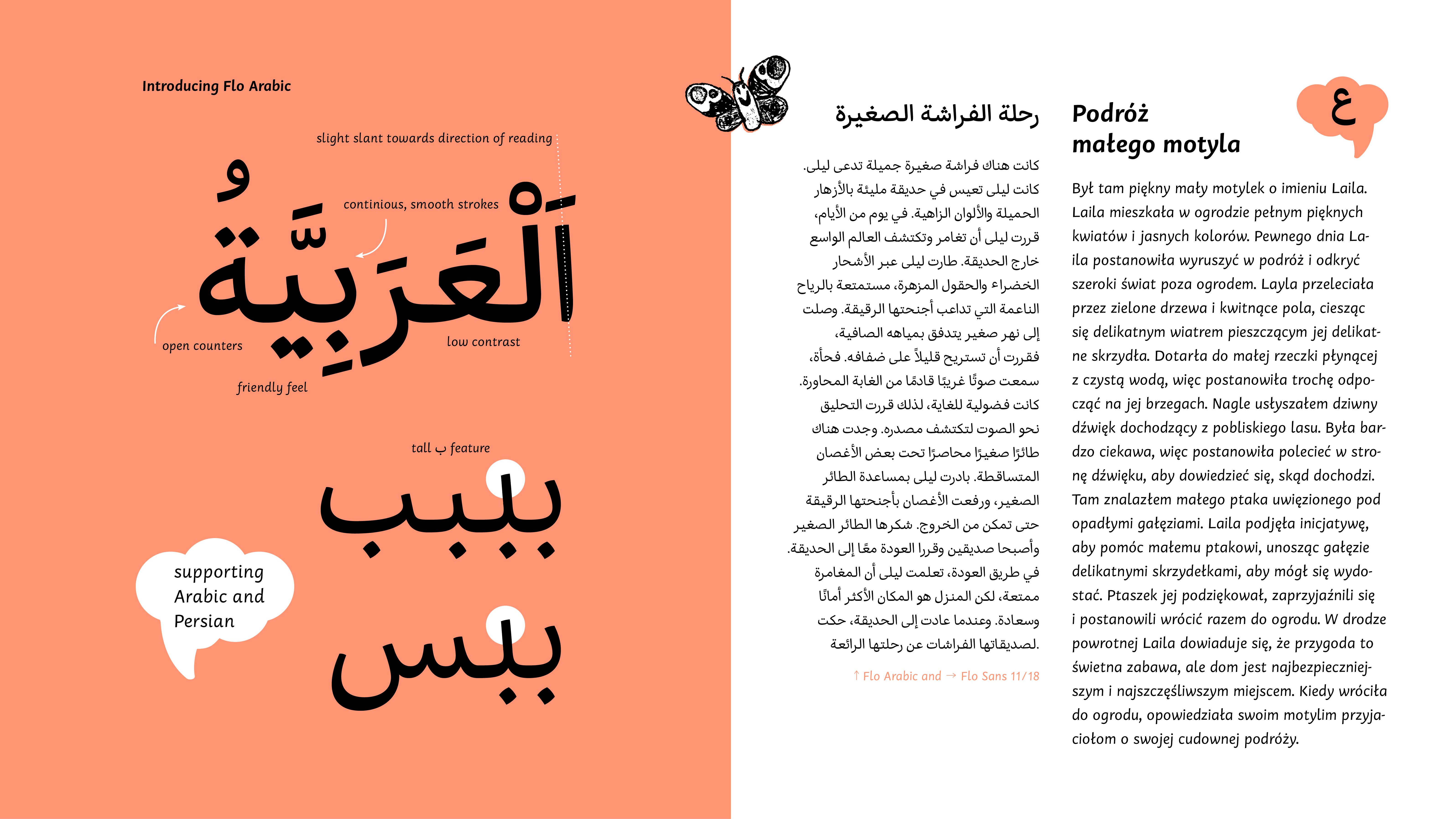
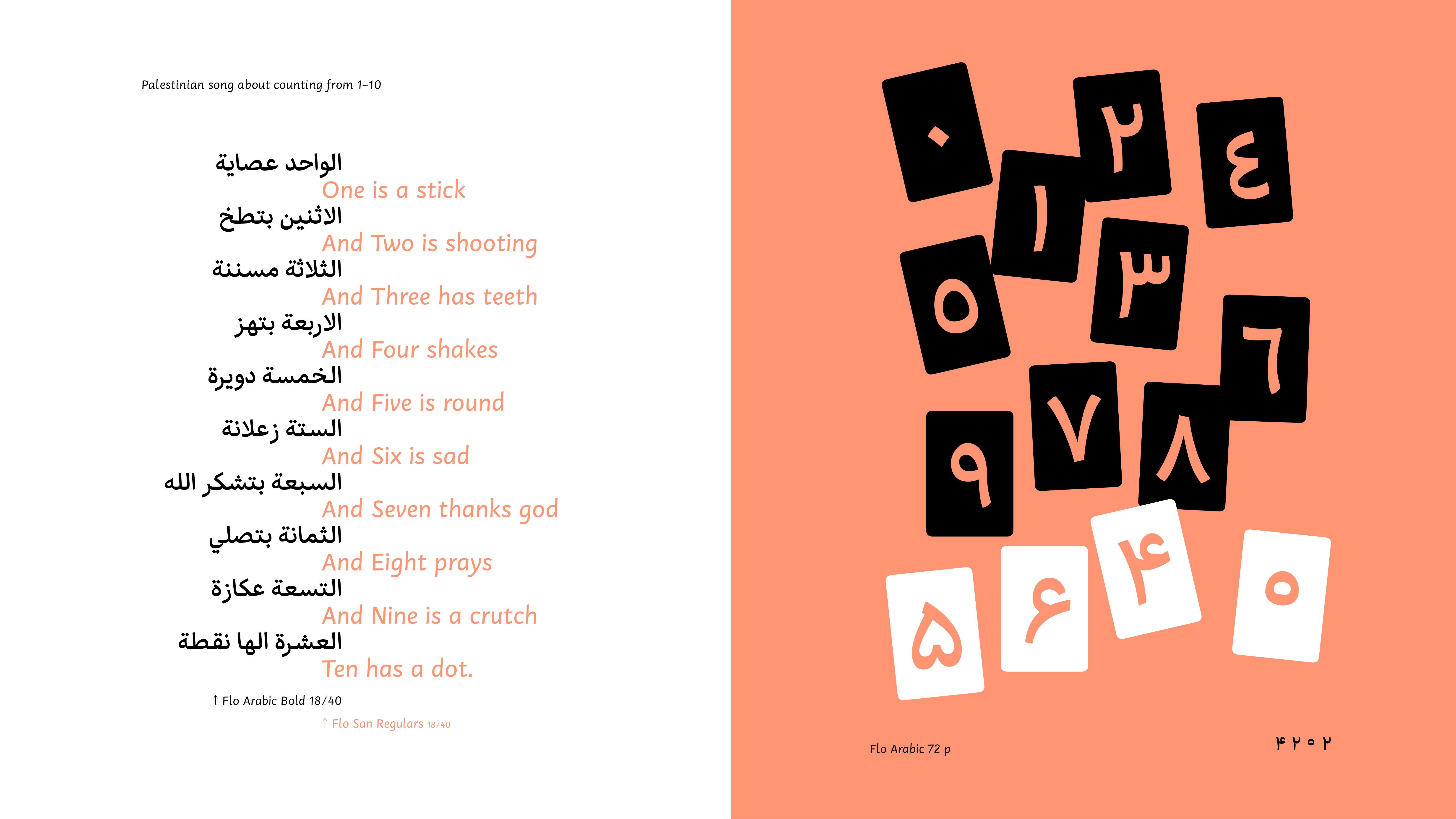
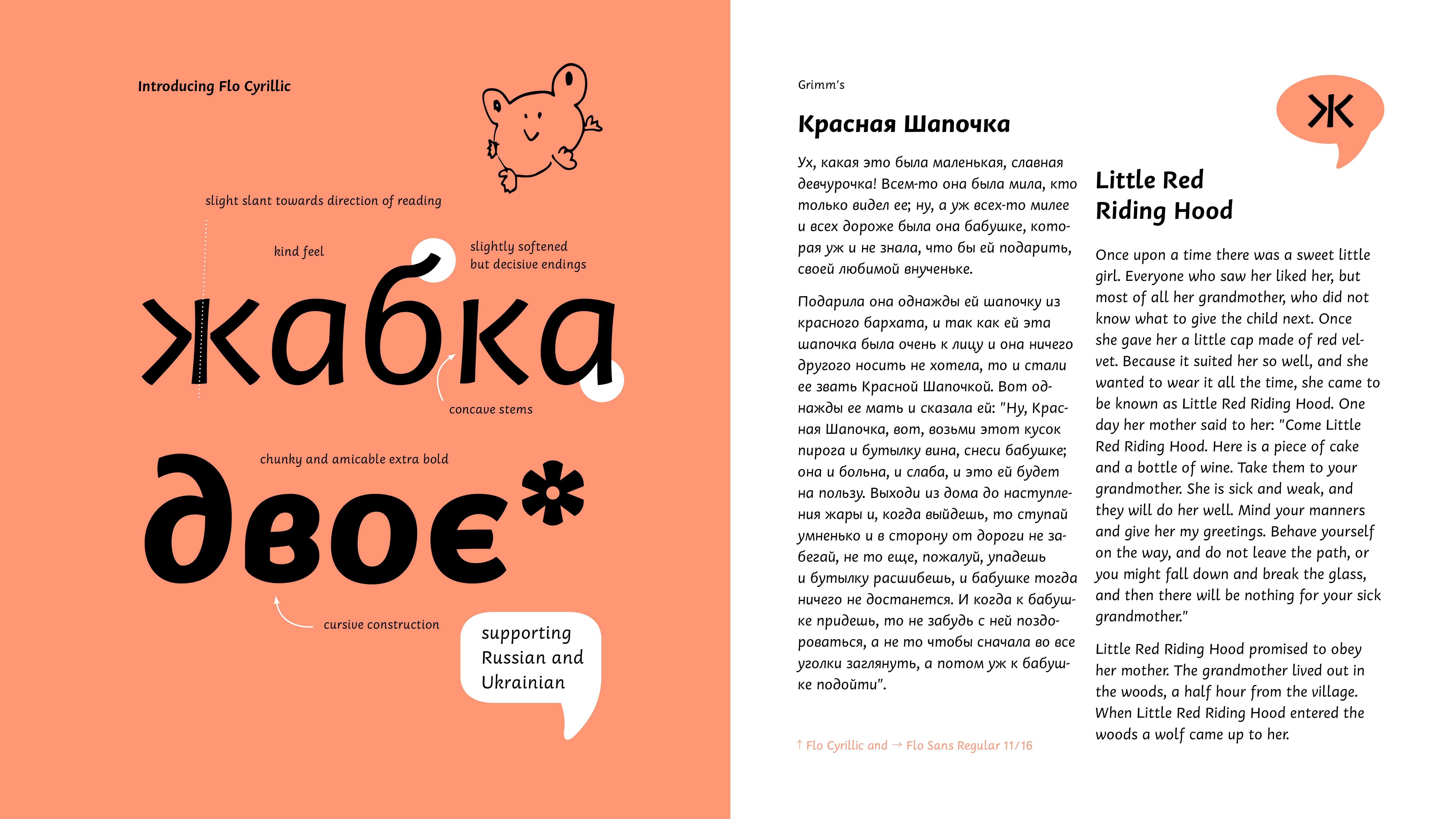
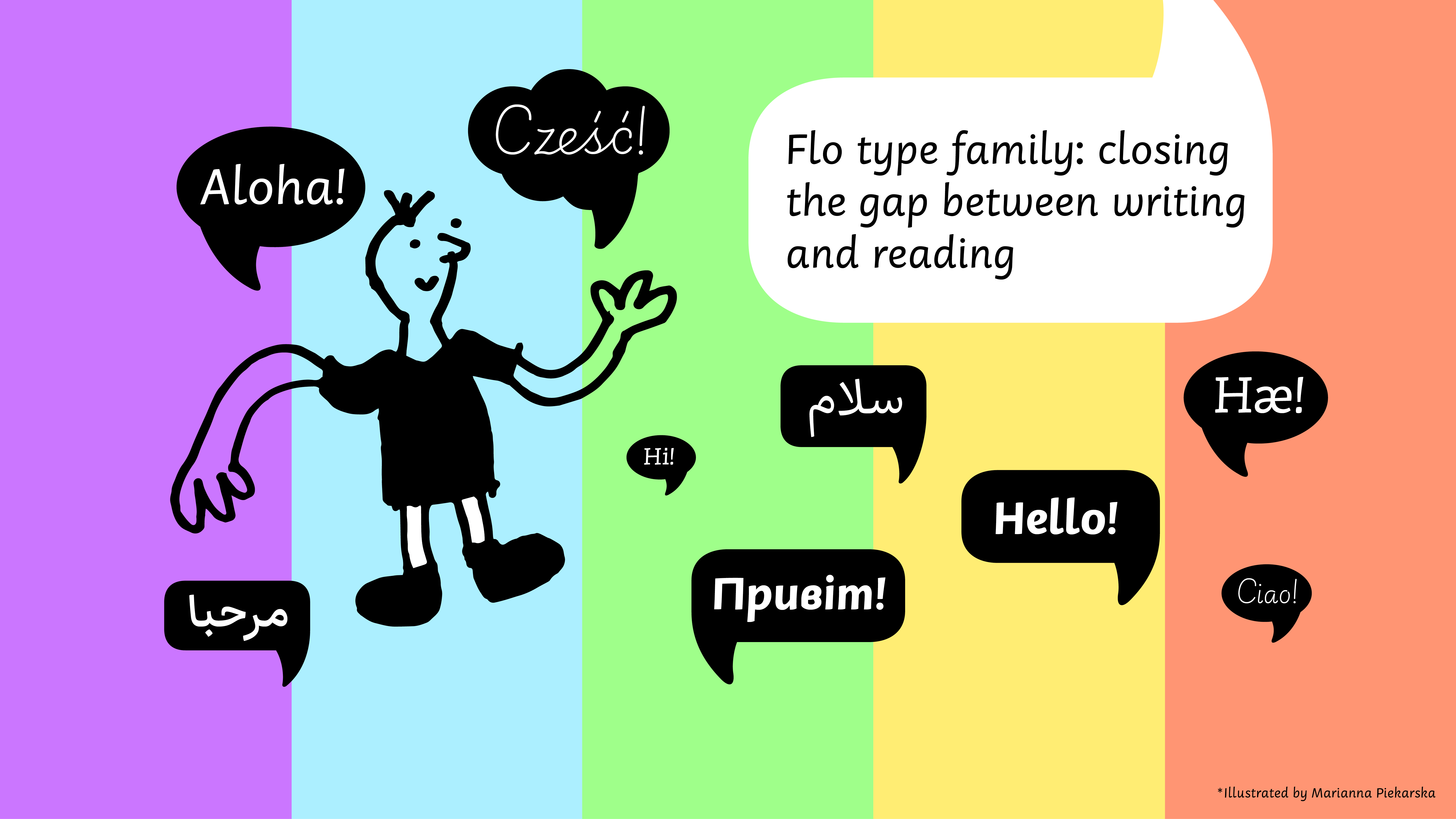
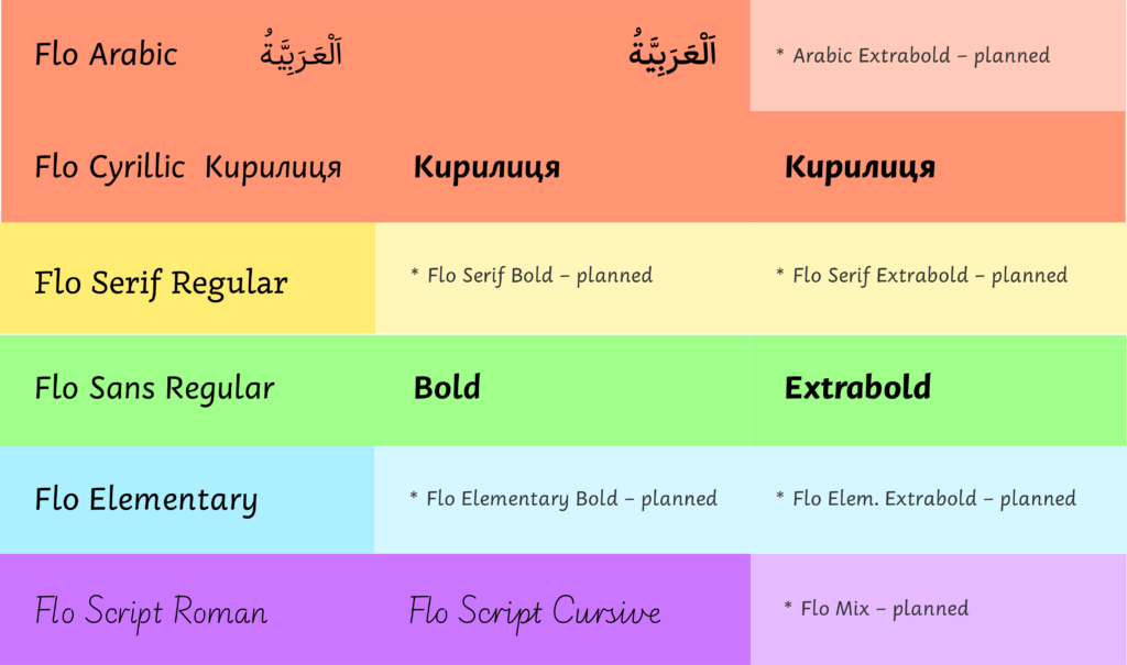
Flo is a Latin typeface that supports all European and South American languages. One of the styles, Flo Sans, also features Arabic (including Persian) and Cyrillic (for Russian and Ukrainian). Currently, Flo Sans comes in three weights: Regular, Bold, and Extra Bold. In the future, Flo Serif will be expanded into at least three styles.
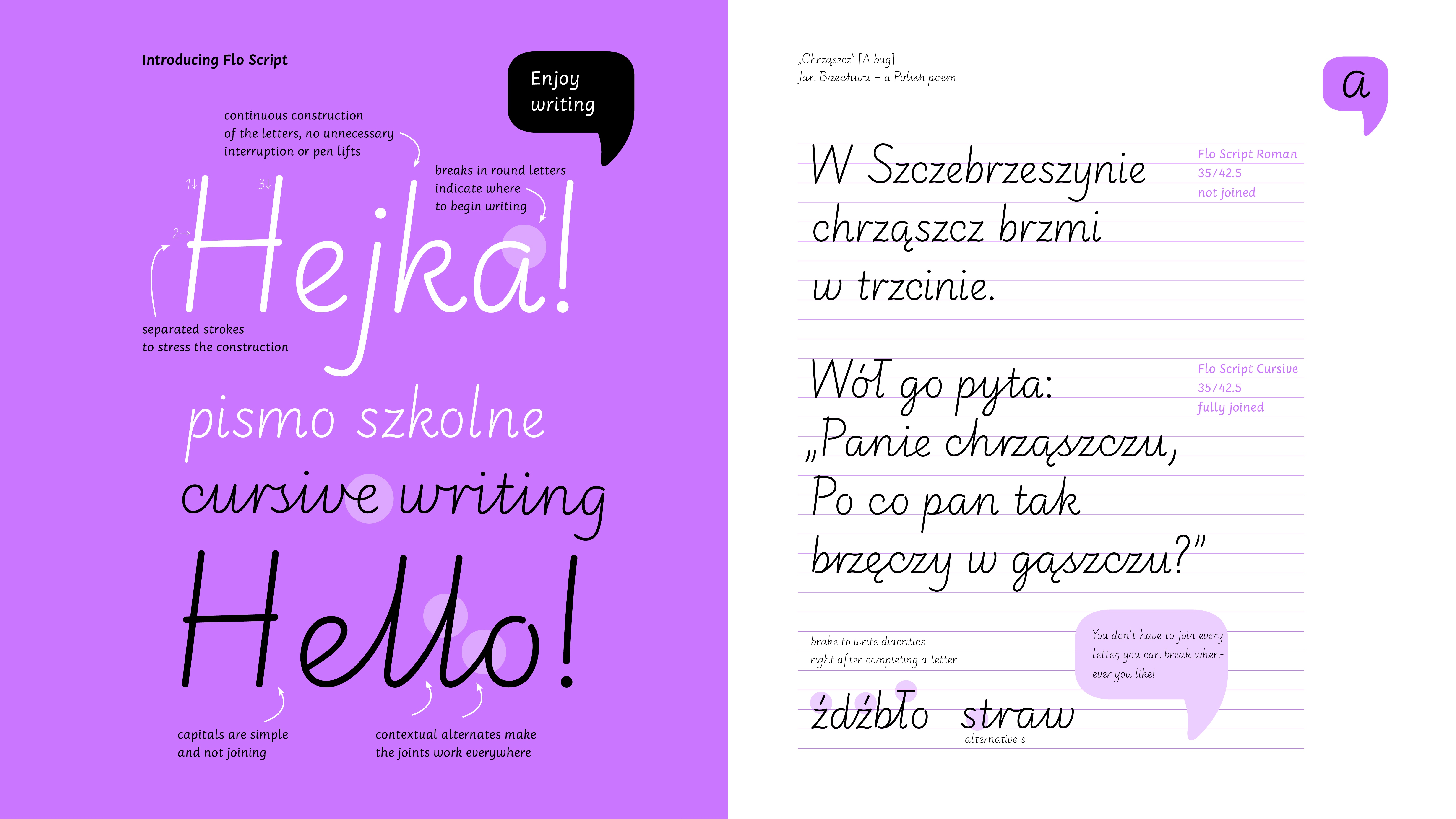
The handwriting model comes in two versions: Roman (unconnected) and Cursive (fully connected), with carefully crafted contextual alternates to resemble real handwriting.
What makes Flo stand out: key typographic features
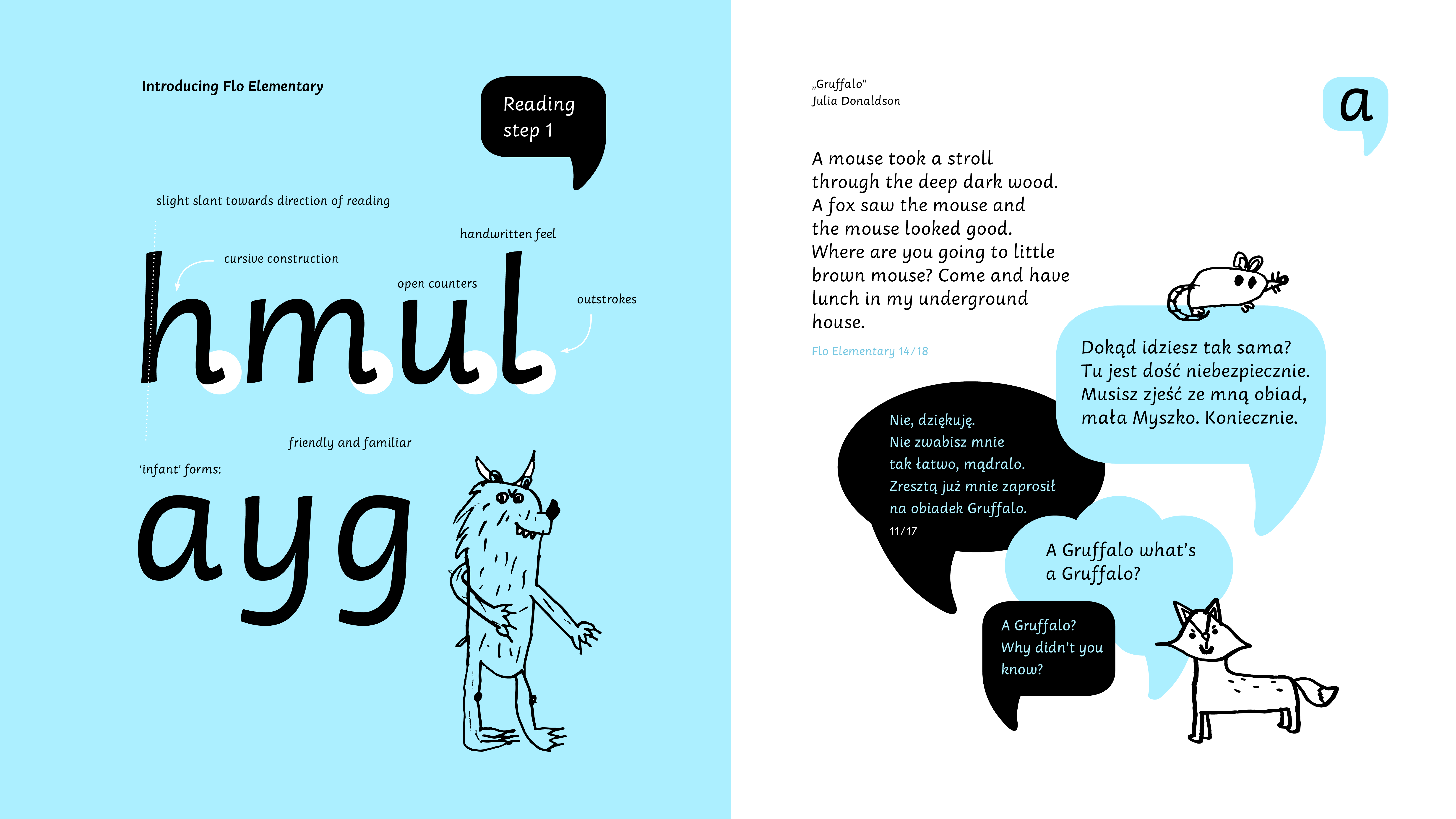
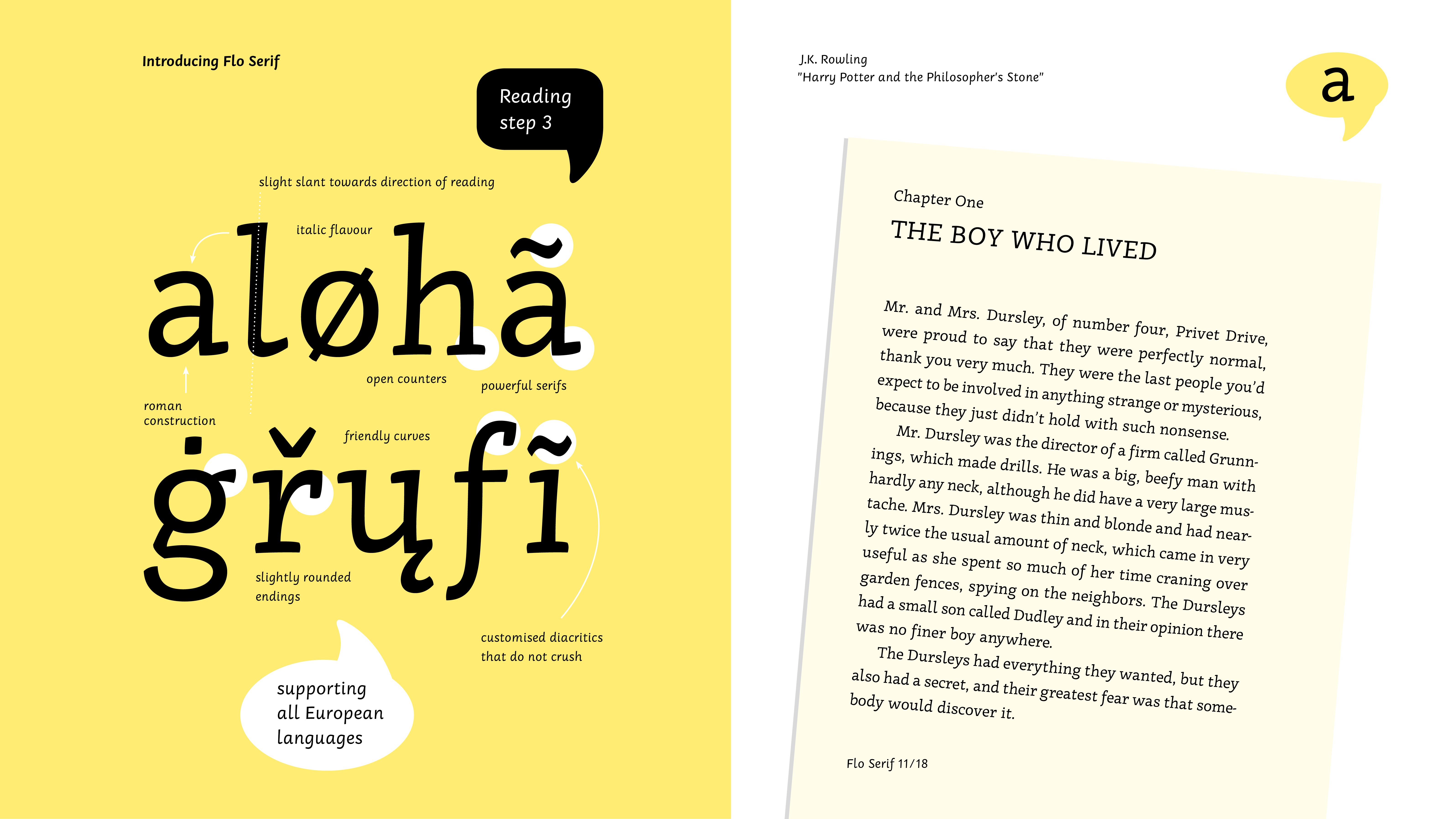
The most distinctive feature of Flo is its cursive construction, derived from handwriting and slightly angled towards the direction of reading. The typeface is curved and friendly, with slightly concave stems and decisive stroke endings that are not blobby. The counters are open, and diacritics are prominent for better legibility.
The Flo Elementary style, the first step in reading, features characteristic outstrokes that push the letters apart, creating more generous spacing, which is ideal for young readers. All Flo styles include cursive, ‘infant’ forms of letters a, g, and k, and a wider space character to prevent word congestion.
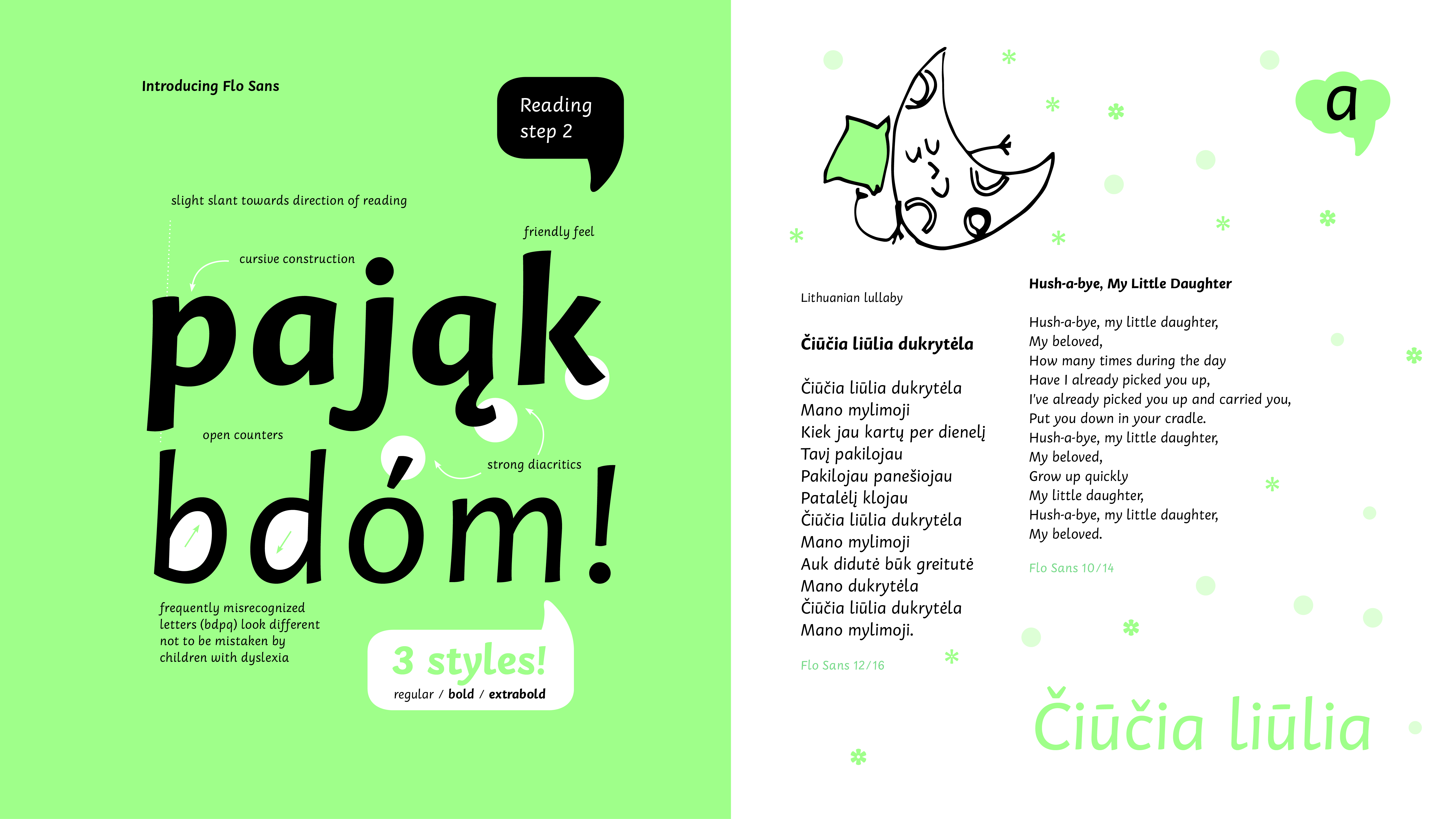
Flo is an inclusive type family that cares about people with disadvantages. The shapes of frequently misrecognized letters have been made distinct enough to avoid confusion for children with dyslexia.
All reading styles feature shorter forms of f and j to avoid crashing into other glyphs. Thanks to these, young readers can avoid the complexity of traditional ligatures. Extra effort was made to design alternative diacritics that prevent clashing, such as for the letter i.
Flo also includes exciting extras like speech bubbles and arrows, enabling playful usage beyond traditional text.
Crafting Flo: the design process
The design process began with collecting and writing down all variants of handwritten letters. From these, Zofia Oslislo chose the simplest and most logically constructed letters and started writing words. Based on the handwriting, the reading model was first developed by sketching on paper. The following sans and serif styles were created digitally.
Some letters, such as k, x, v, w, and y, went through multiple iterations, with at least three versions making it into the final font. Notably, letters with diagonals, such as k, w, y and z, occur frequently in the Polish language and can create a distinct texture compared to English. To address this, slightly different, rounded versions of these letters were incorporated into Flo Script and Elementary, and Sans helping to maintain an even texture throughout.

The process had a few turning points, such as redoing the bold weight three times to achieve the intended weight, size, and feel. The construction of Sans and Serif also changed along the way. Contrast adjustments were essential in Serif, and these little decisions pushed the styles further apart, creating a more versatile type family.
Flo in action: ideal use cases
Flo is particularly tailored for early learners, children aged 6–9. Its natural environment includes primers, children’s books, and picture books. The familiar, warm, and welcoming voice of the typeface makes it ideal for typesetting short stories, poems, and songs. At the same time, its legibility and efficiency will give educational materials used in schools and kindergartens a professional and friendly appearance.
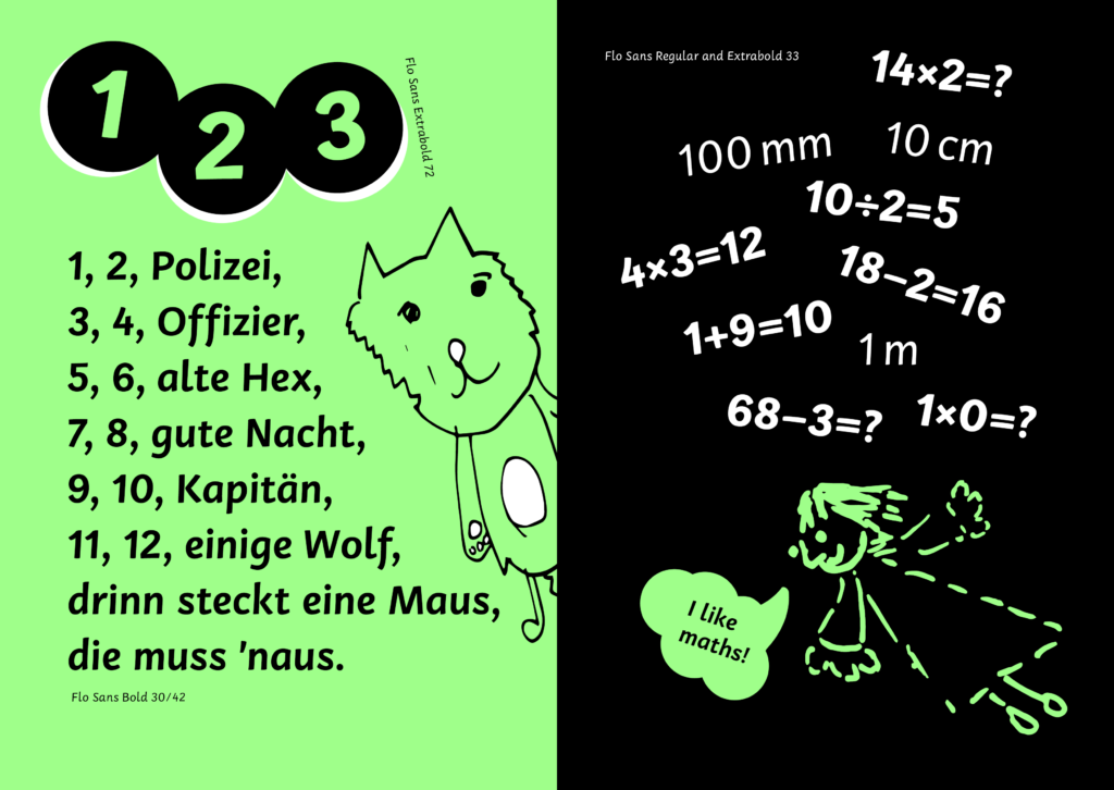
By addressing the dual challenges of writing and reading in early education, Flo offers a comprehensive, thoughtfully designed solution that makes learning a more seamless and enjoyable experience for young learners.
