
Eirene | Natalie Giesel
Eirene is a multi-script serif typeface with generous contrast, blending traditional inspiration and contemporary flair. It is most suitable for editorial and multi-typesetting environments. Eirene supports Latin, Greek and Arabic scripts.
The name Eirene originates from Greek and stands for the Greek goddess of peace, ‘Eirene‘. The name evokes a connection to the Greek script, as it was a focal point during the design process, additionally gibing it a classic flair that is reflected in the typeface. The name Eirene is still commonly used today, demonstrating that it is also contemporary, keeping the spelling of the name with an ‘E’ to retain the original Greek sound.
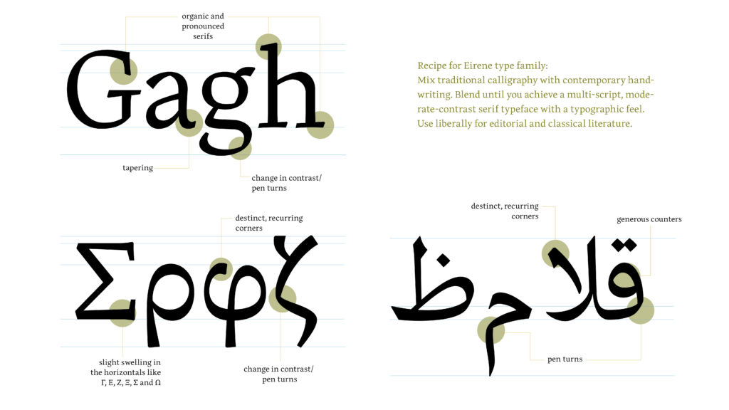
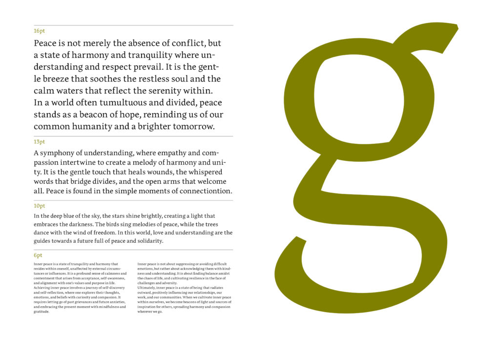
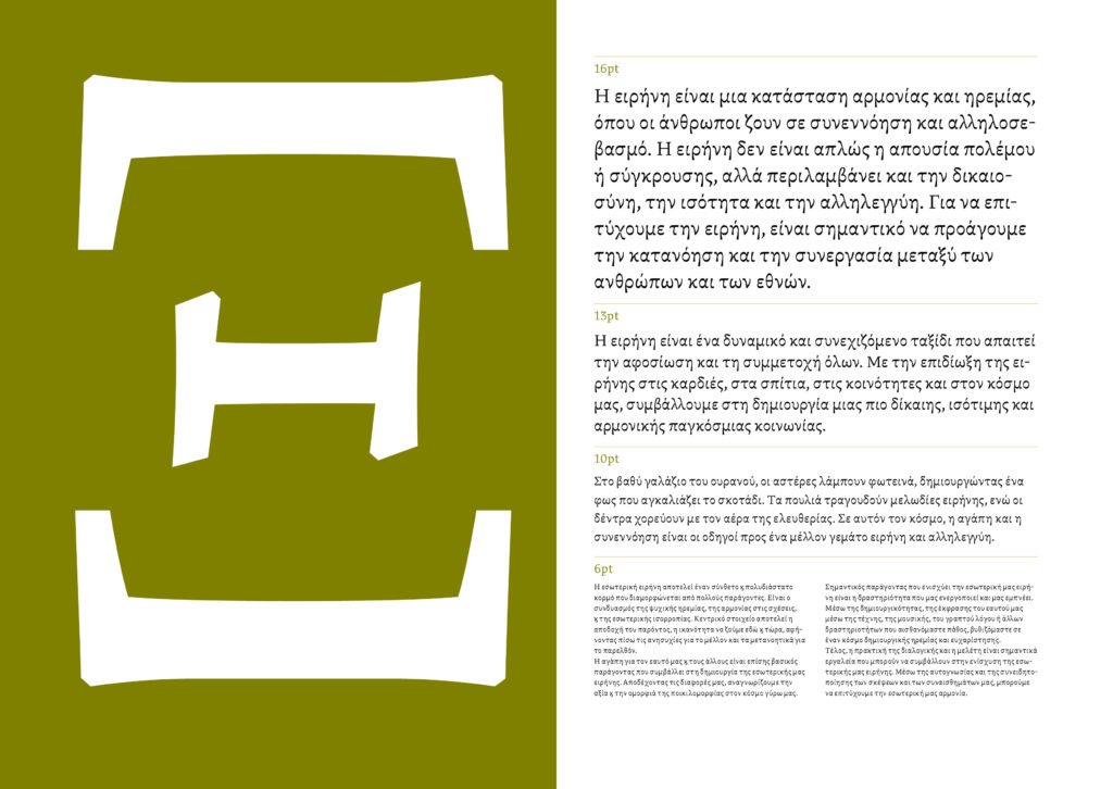
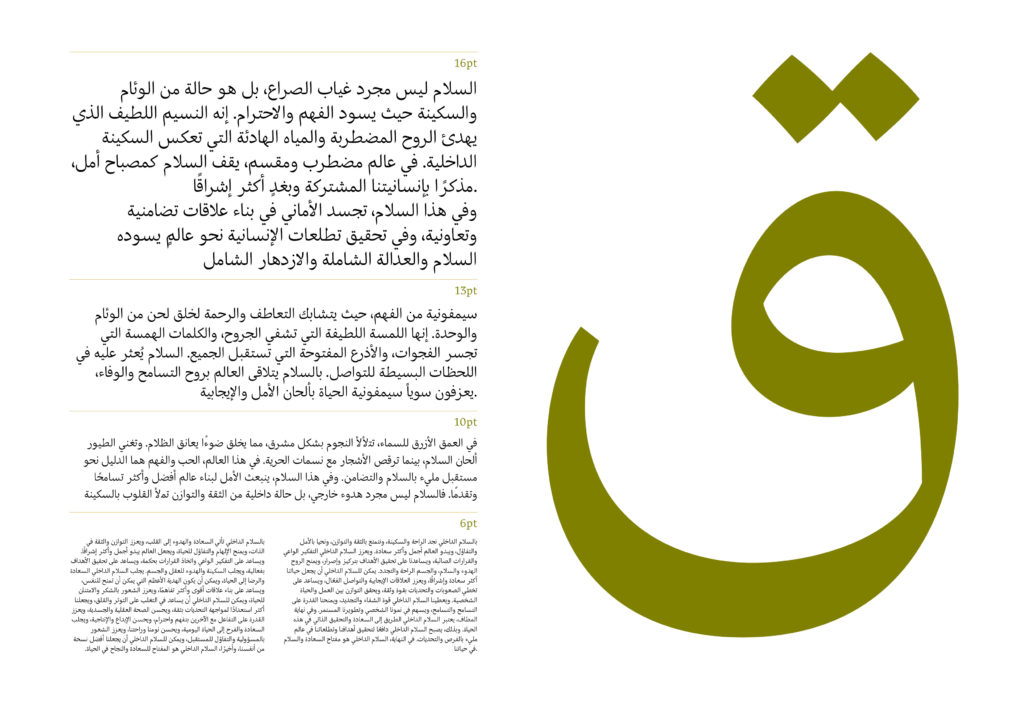
The Latin upper and lowercase letterforms have asymmetrical and pronounced serifs. The uppercase shows flares in the horizontal strokes. Some lowercase letterforms indicate round shapes with crisp turning points while other characters are defined by the stroke itself. The proportions of the lowercase letters have a more contemporary feel, whereas the uppercase letters evoke a more classical feel. The Greek uppercase letters resemble the Latin ones in stroke modulation and overall feel. The lowercase letters have a classical-inspired contrast with a contemporary interpretation. The Arabic letterforms are based on traditional calligraphic shapes. Distinct corners are used across all scripts to avoid sharp edges. Expressive strokes contribute to the overall look and feel of the typeface.
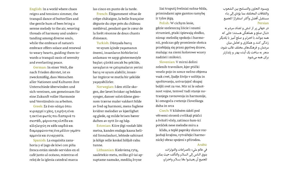
Eirene covers a spectrum of languages that use the Latin and Extended Latin scripts. Case-sensitive diacritics were designed to enhance typesetting and readability. Additionally, Eirene supports languages written in monotonic Greek, as well as Arabic and Persian. Examples of supported languages are shown below.
The goal of designing all three scripts simultaneously was to achieve a stable rhythm and balanced stroke widths, minimising the need for compromises in each script.
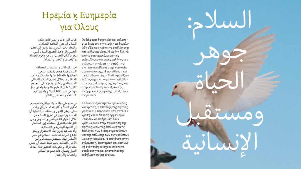
Images from: unsplash.com