CitadelVF | Shin G.
Classical forms and contemporary pragmatism define the Citadel typeface family.
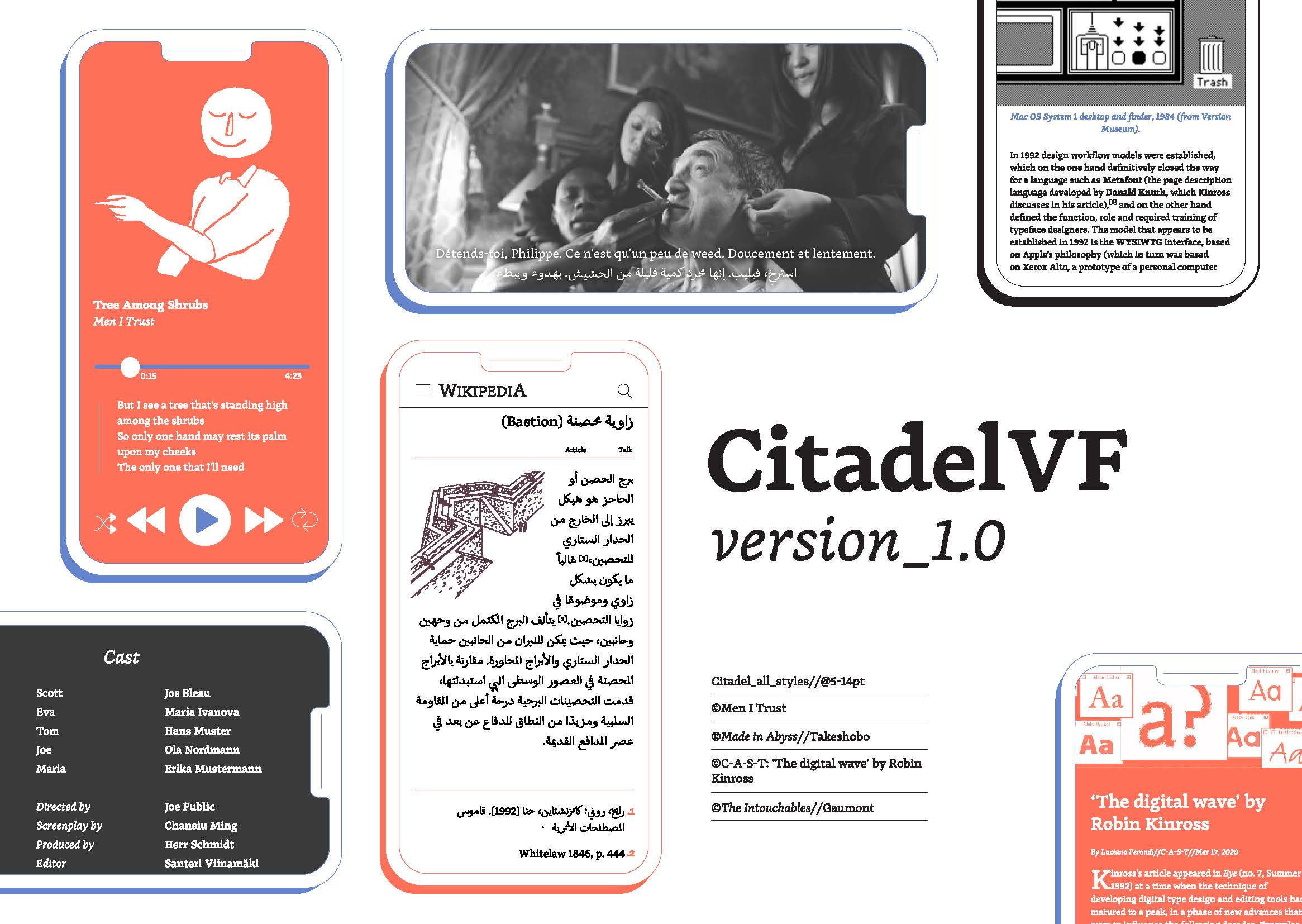
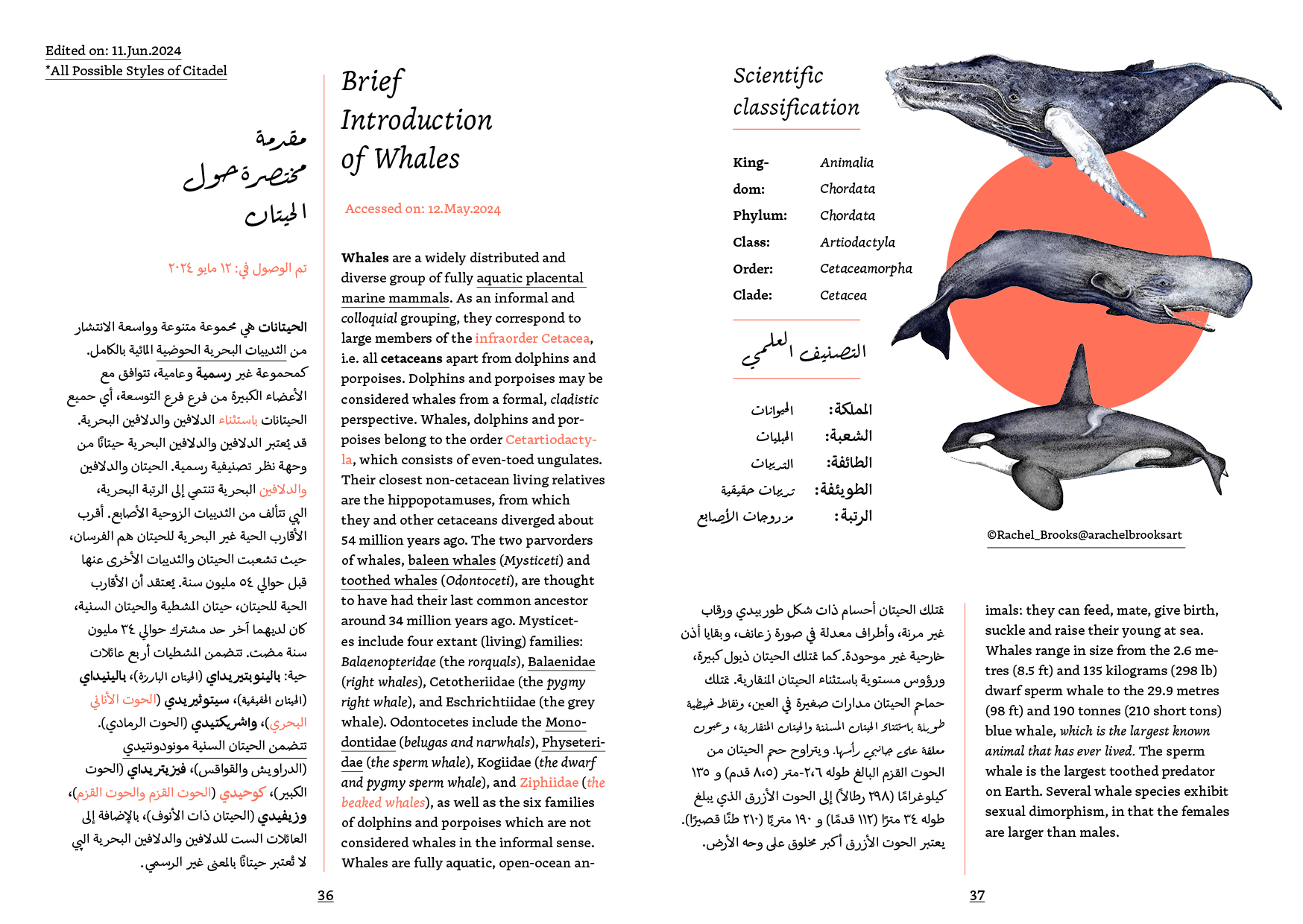
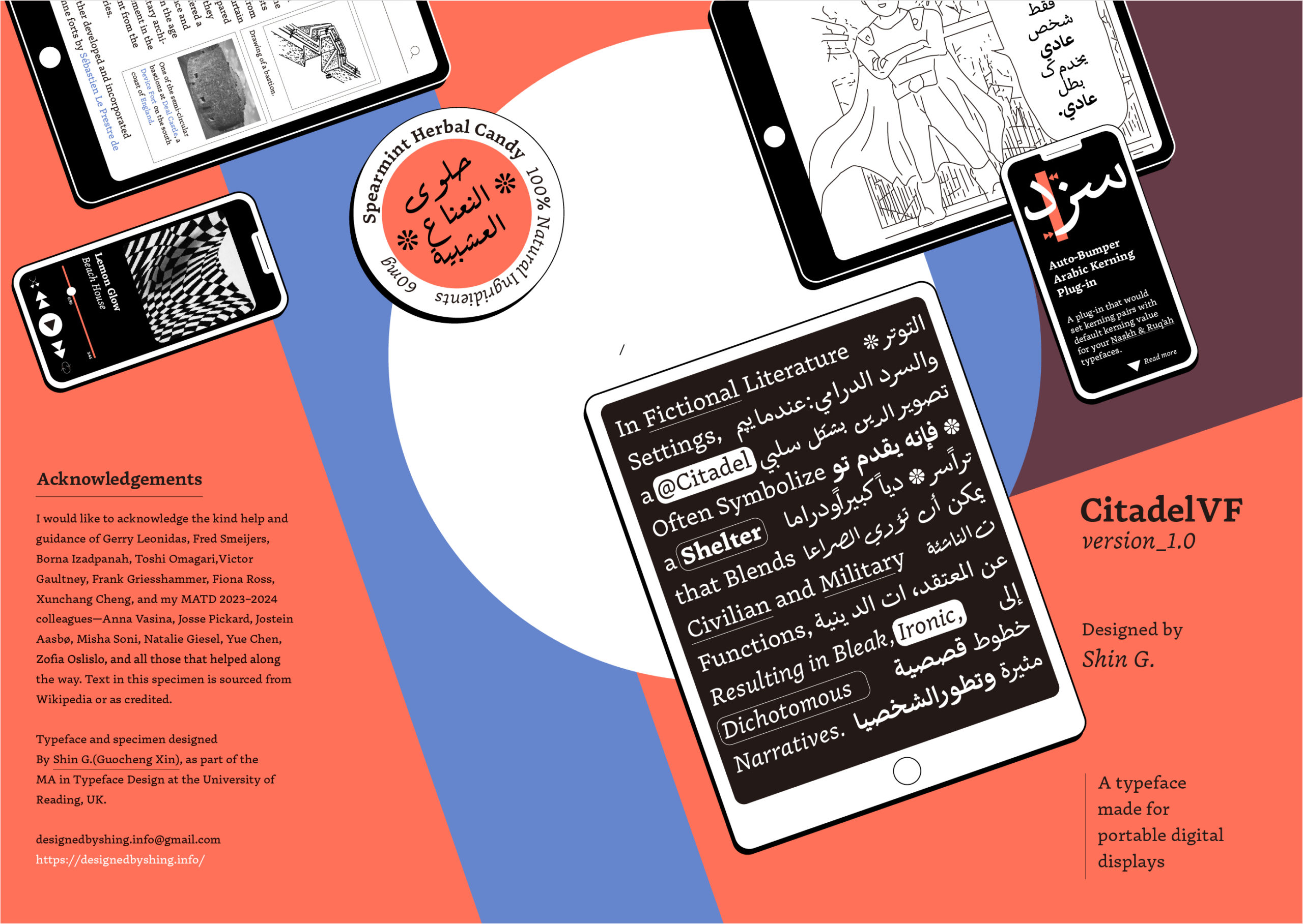
The Citadel family is an eye-friendly, low-contrast serif typeface designed for portable digital devices, blending the timeless aesthetics of early Humanistic metal type models. Citadel supports Latin and Arabic scripts, accommodating all Western European languages and most Central and Eastern European languages, including Czech, Polish, and Turkish.
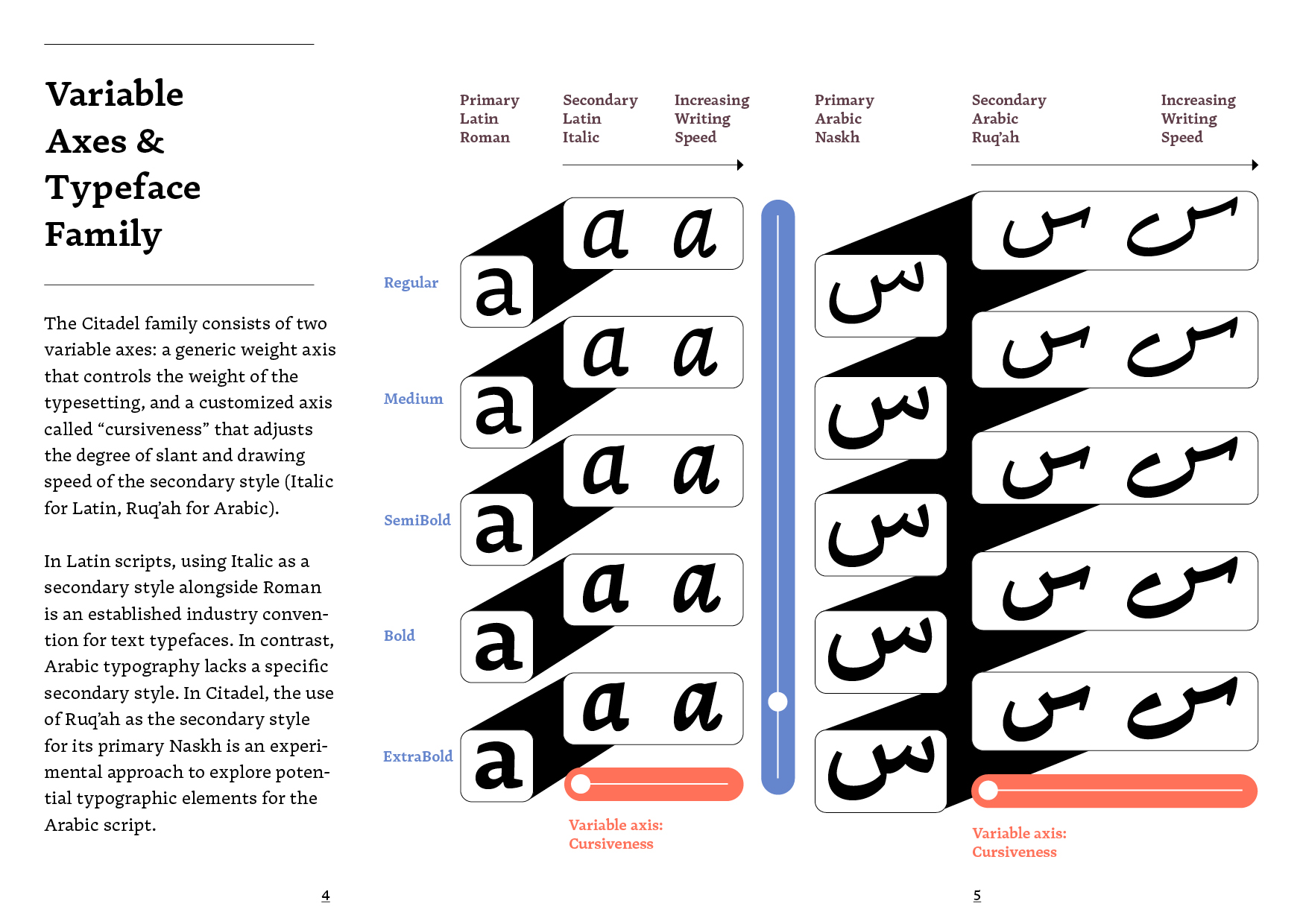
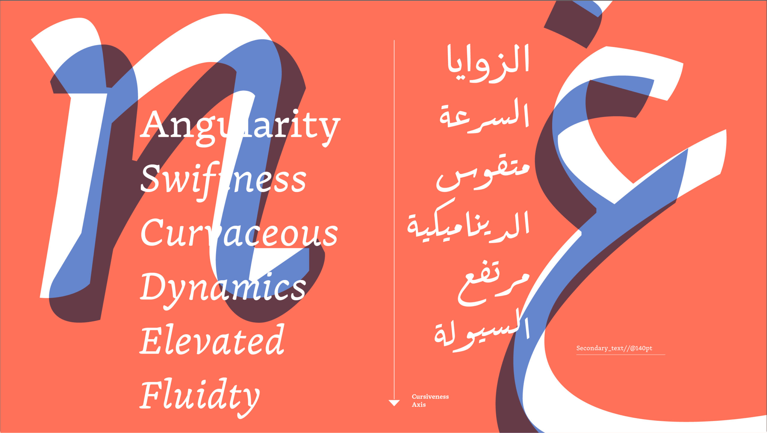
As a variable font family, Citadel comprises two variable axes: a generic weight axis that adjusts the typesetting weight, and a customised axis called “cursiveness” that modulates the degree of slant and drawing speed of the secondary style (Italic for Latin, Ruq’ah for Arabic). These expanded options enable users to manage complex typography tasks in both digital and print settings.
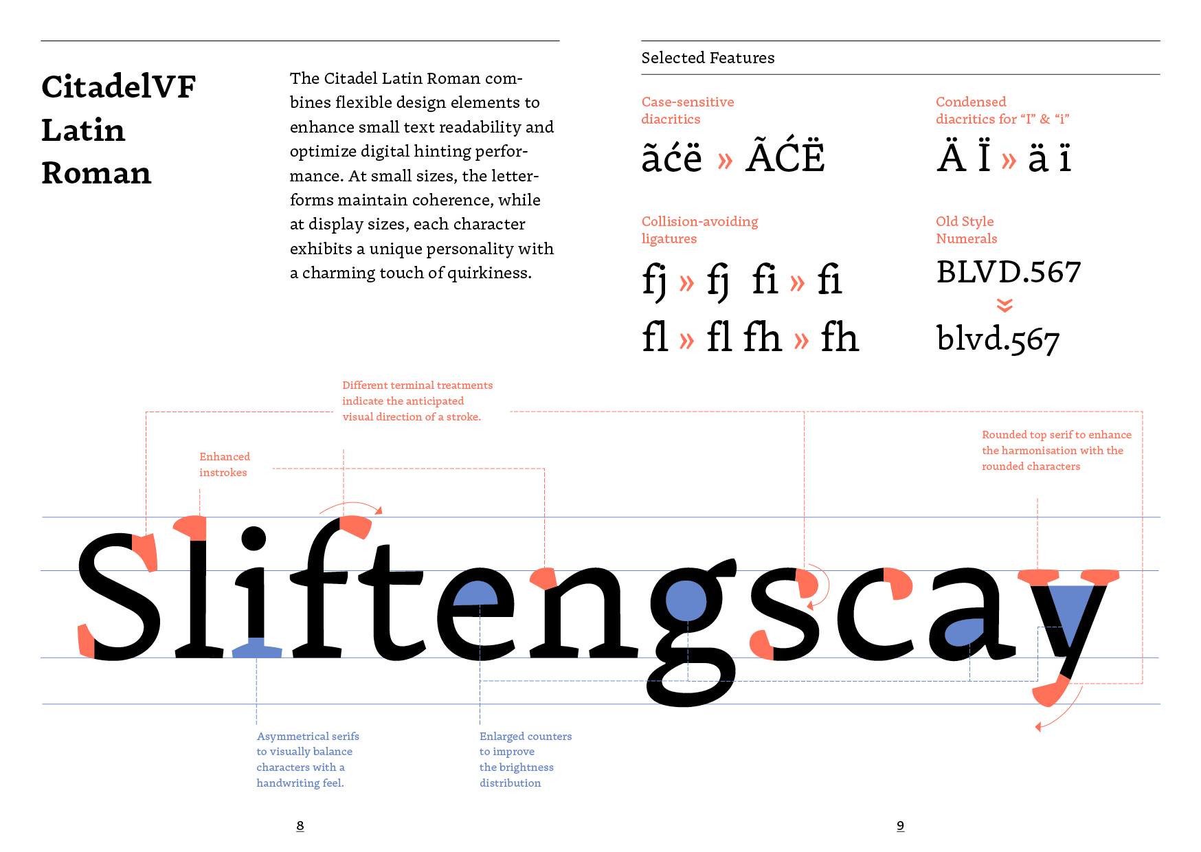
The Citadel Latin Roman integrates flexible design elements to enhance small text readability and optimise digital hinting performance. At small sizes, the letterforms maintain coherence, while at display sizes, each character exhibits a unique personality with a charming touch of quirkiness.
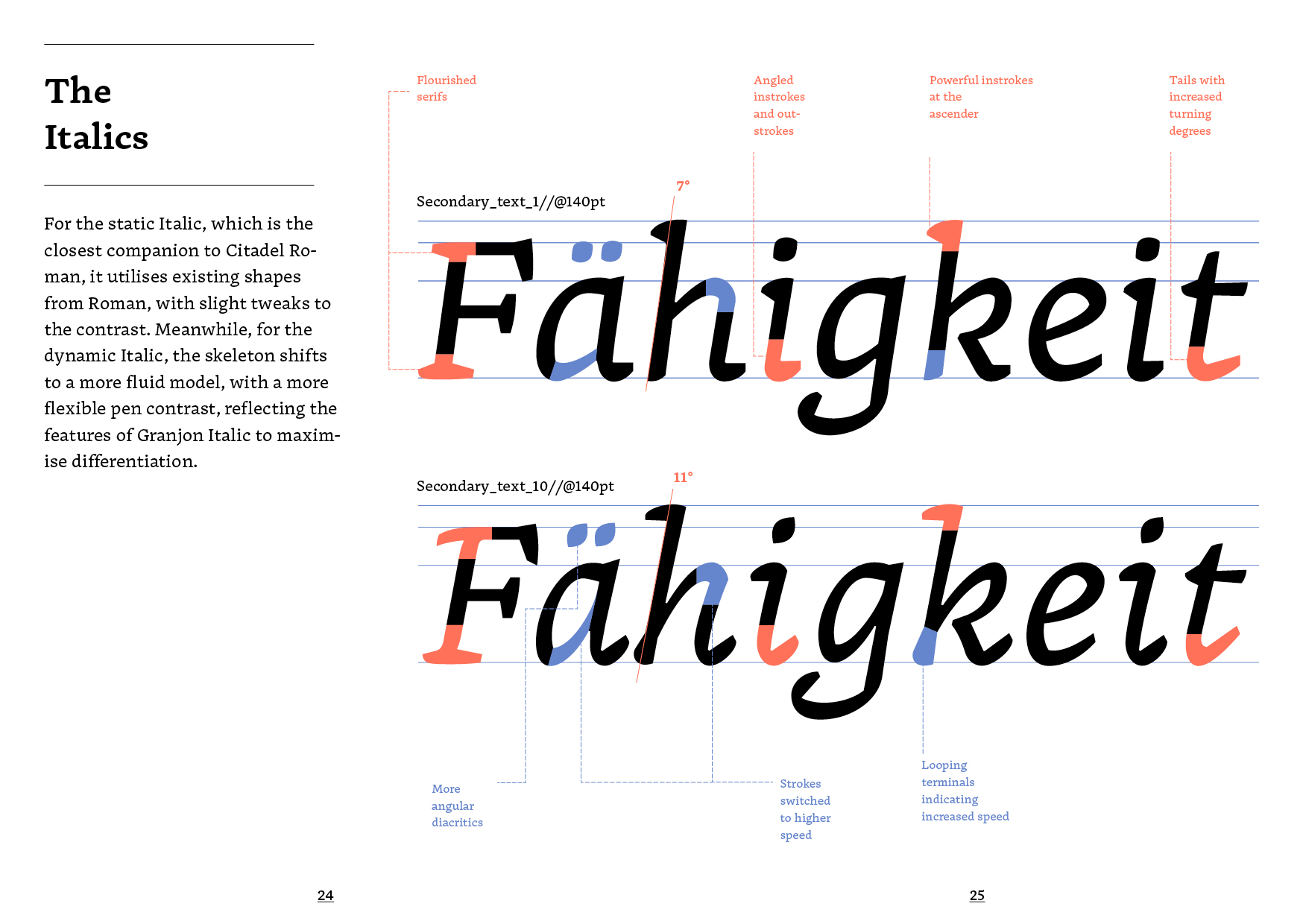
For different typography tasks, users may prefer a secondary style closely resembling the primary style. However, when reading texts, users might desire a secondary style that distinctly highlights selected information, such as the title of a book. Balancing these opposing demands with a single typeface family is challenging. To address this, Citadel offers a set of variable secondary styles, allowing users to determine their preferred degree of differentiation.
The differentiation of the two extremities of Italic is more than the italic angle and proportions. For the static Italic, which is the closest companion to Citadel Roman, it utilises existing shapes from the Roman with slight tweaks to the contrast. Meanwhile, for the dynamic Italic, the skeleton shifts to a more fluid model, with a more flexible pen contrast, reflecting the features of Granjon Italic to maximise differentiation.
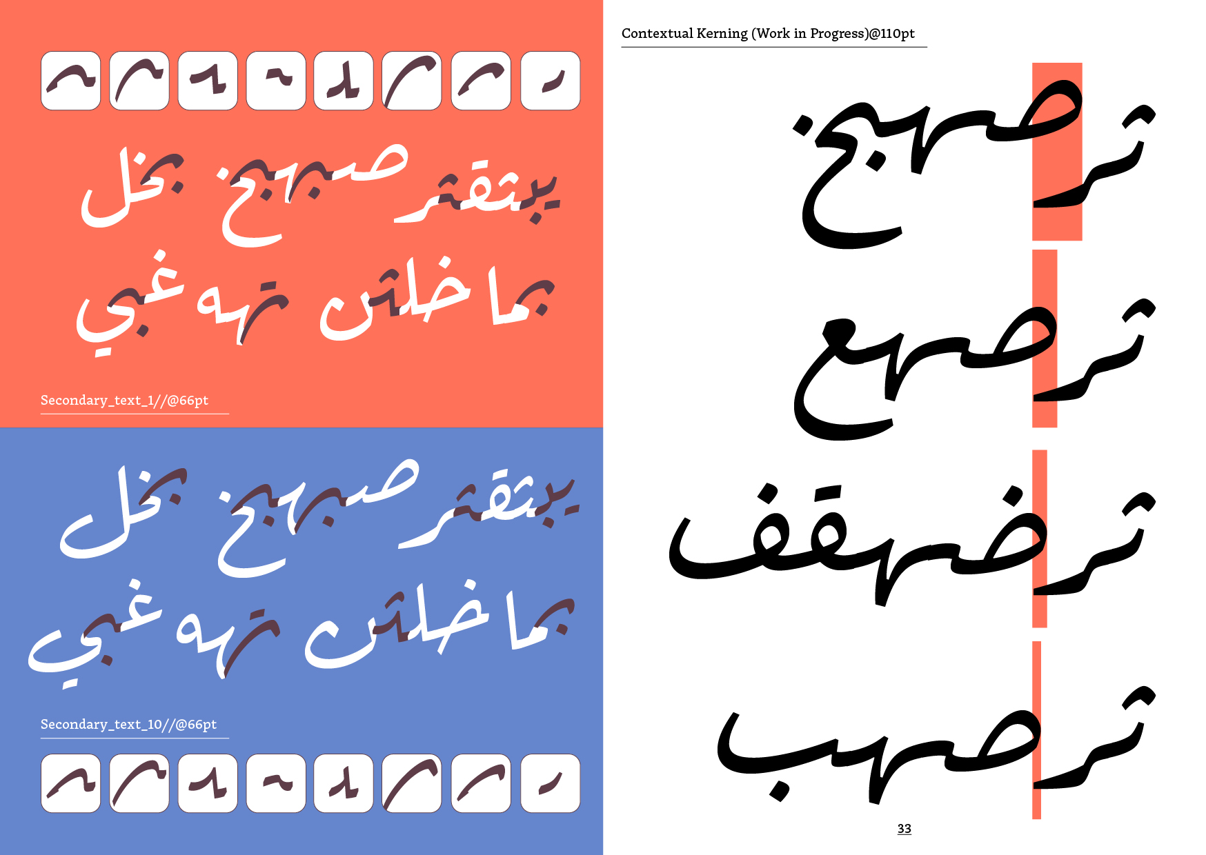
Unlike the Italic style for Latin, which is a conventional secondary style, finding proper secondary styles in Arabic is challenging due to the lack of historical precedence in Arabic typography. In Citadel, the use of Ruq’ah as the secondary style for its primary Naskh is an experimental approach to explore potential typographic elements for the Arabic script.
In academic and casual writing, Ruq’ah has proven to be a practical style for efficient note-taking. Therefore, in Citadel, the Ruq’ah style reflects casual cursive writing rather than refined calligraphy. While contextual alternative forms in Naskh serve as a stylistic preference, they are essential for the typographic grammar of Ruq’ah typefaces. Citadel Arabic Secondary is fully equipped with these flexible forms to ensure the functionality of its Ruq’ah. At the same time, the contextual kerning, or cascade kerning, of the Citadel Ruq’ah has been designed along the process of alignment configurations, to ensure the diagonal black and white rhythm is cohesive on the typesetting surfaces.
