Aki | Yue Chen
A contemporary, expressive typeface with calligraphic nuances.
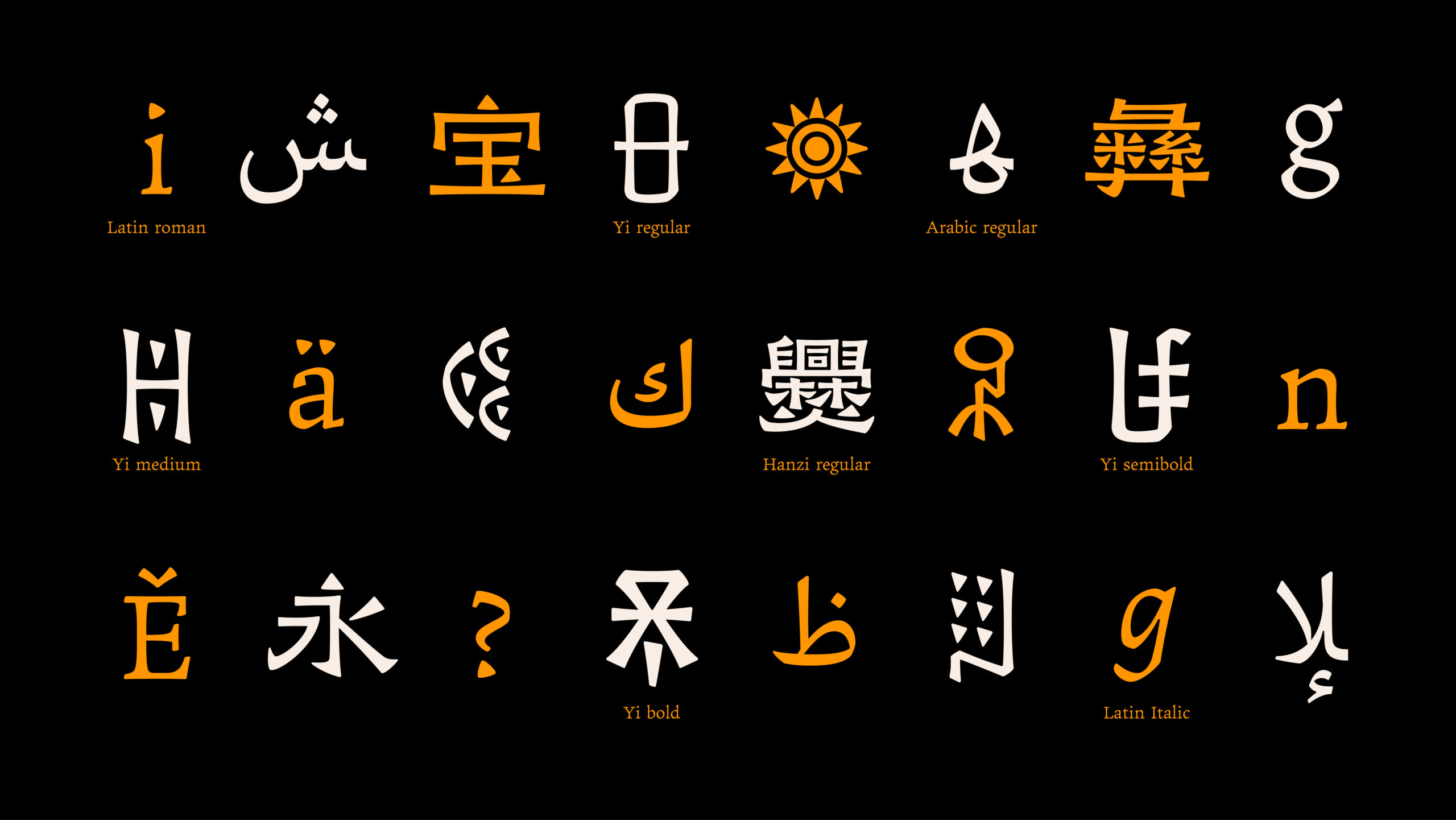
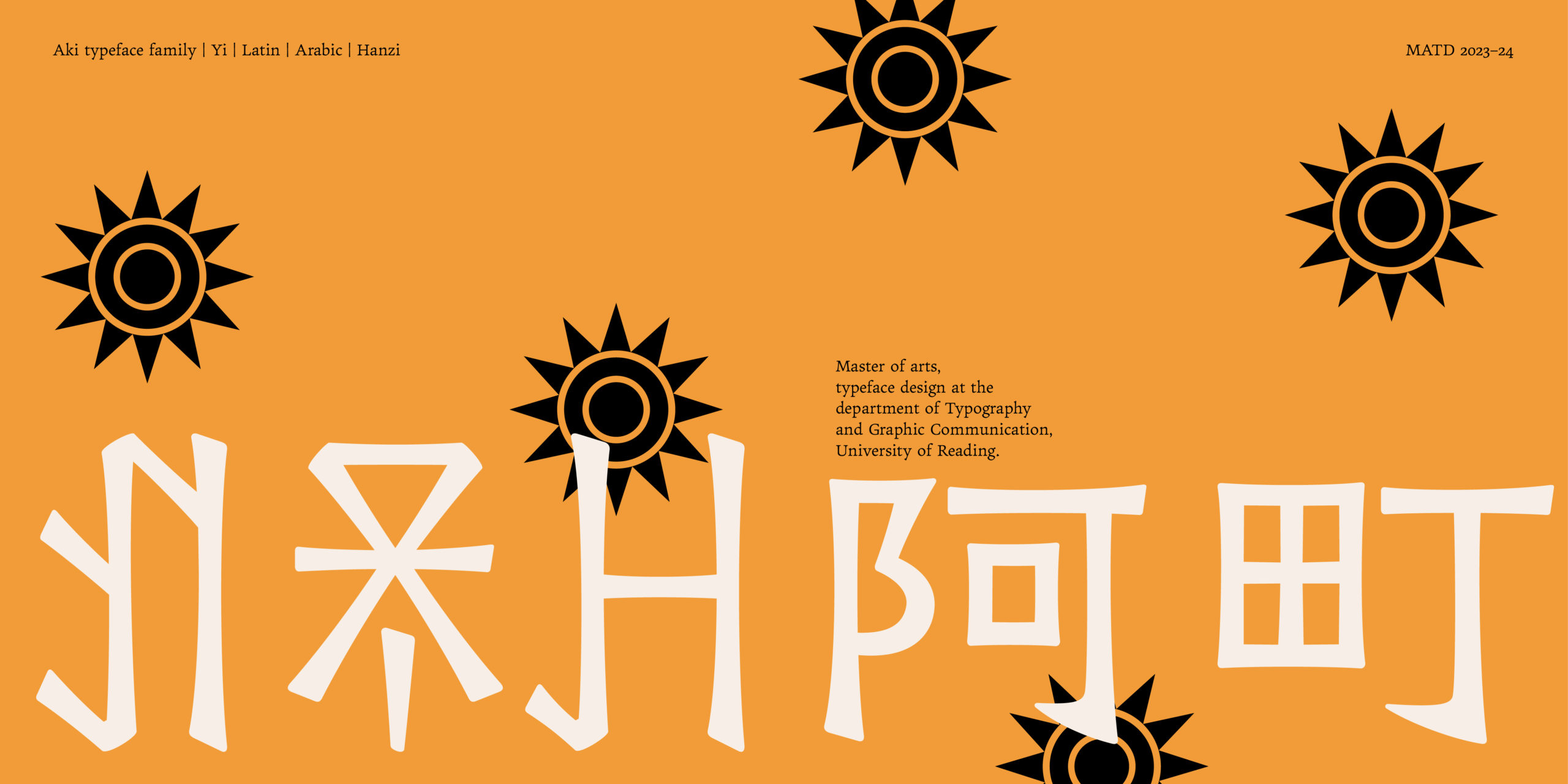
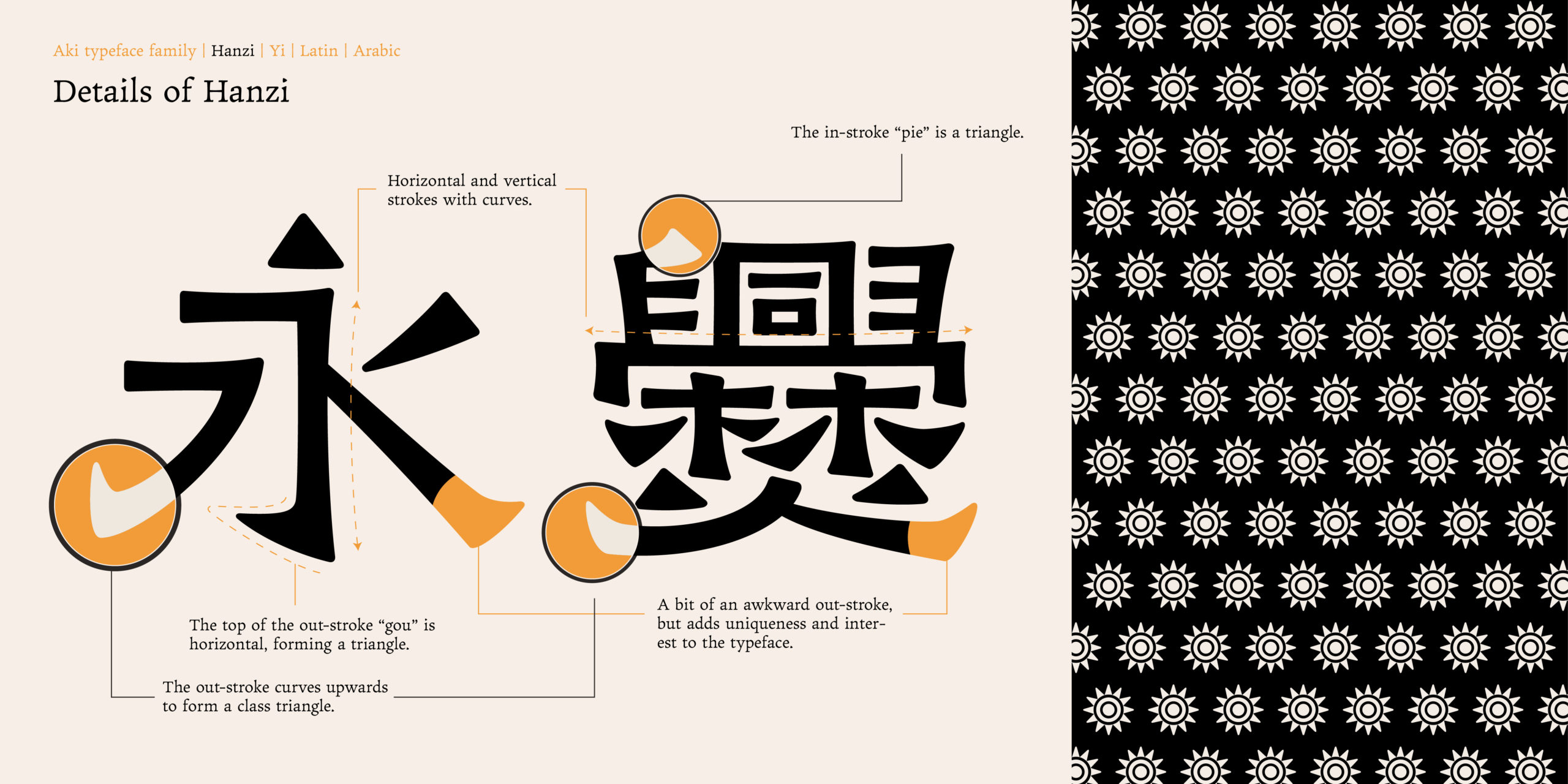
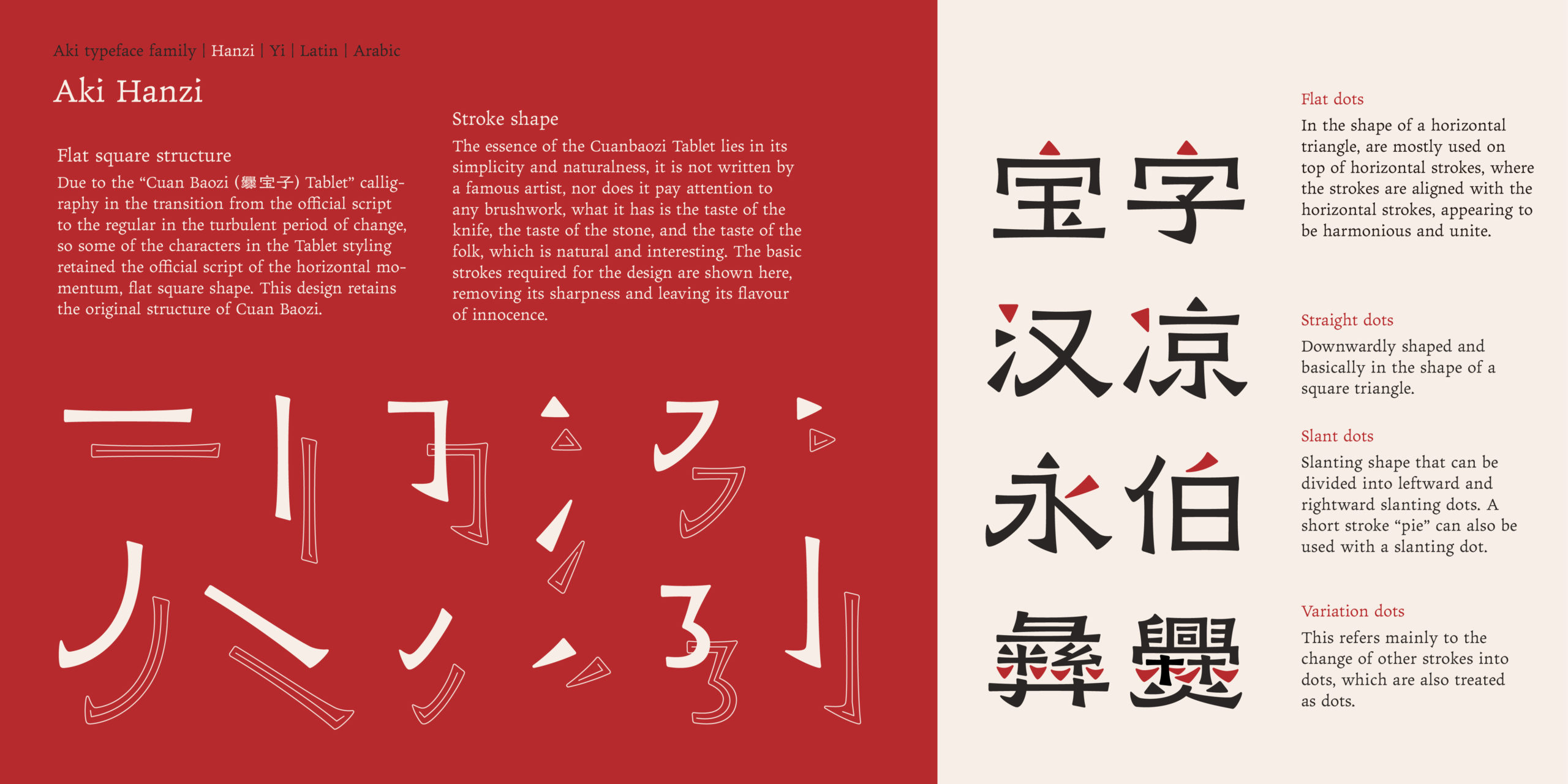
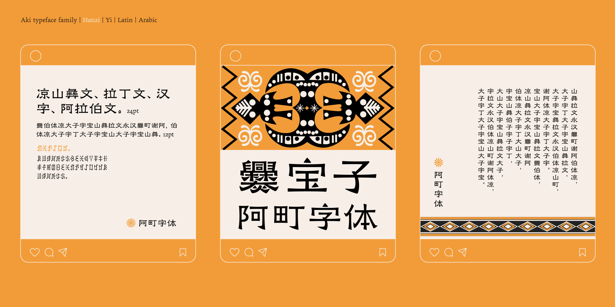
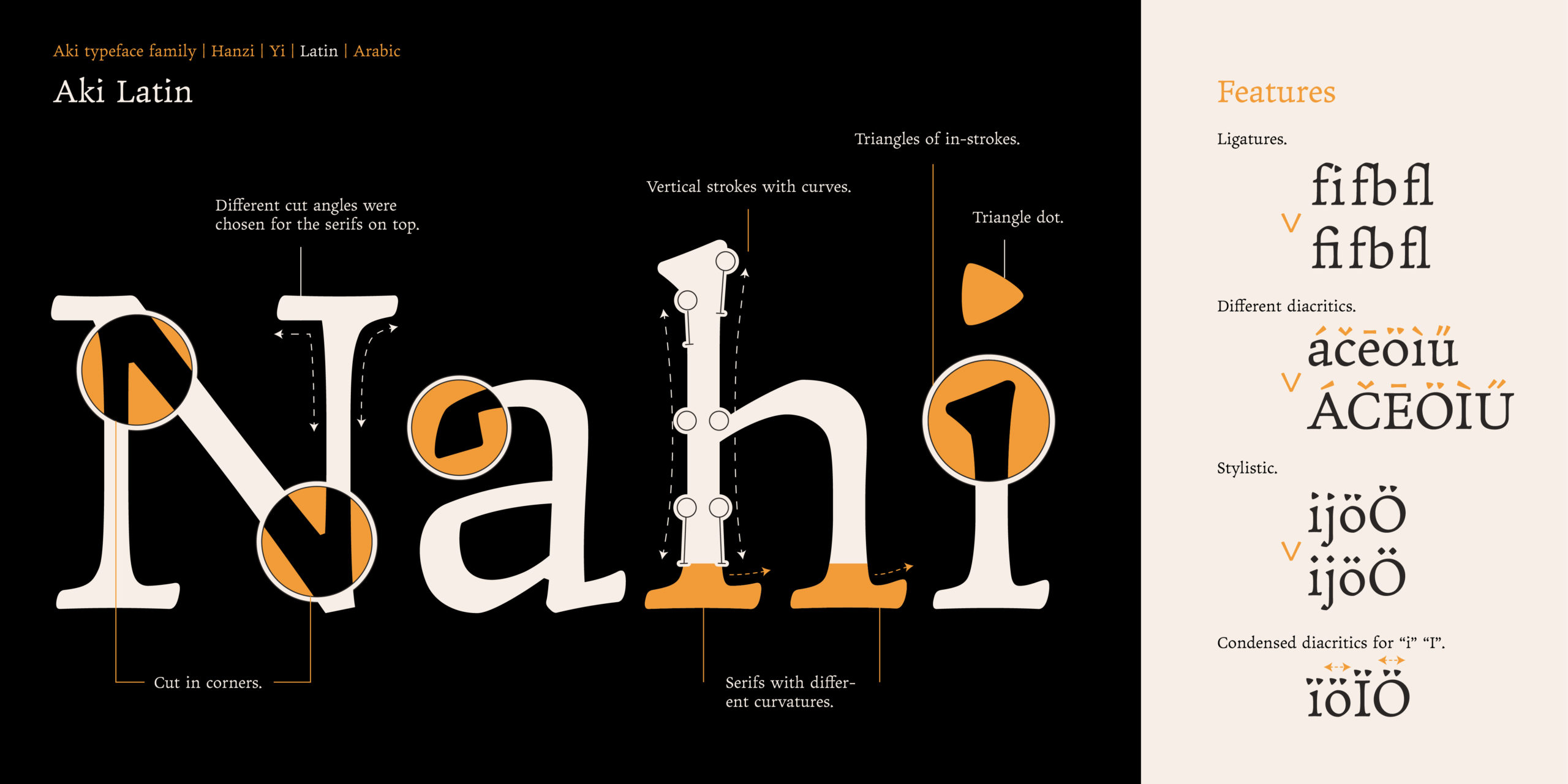
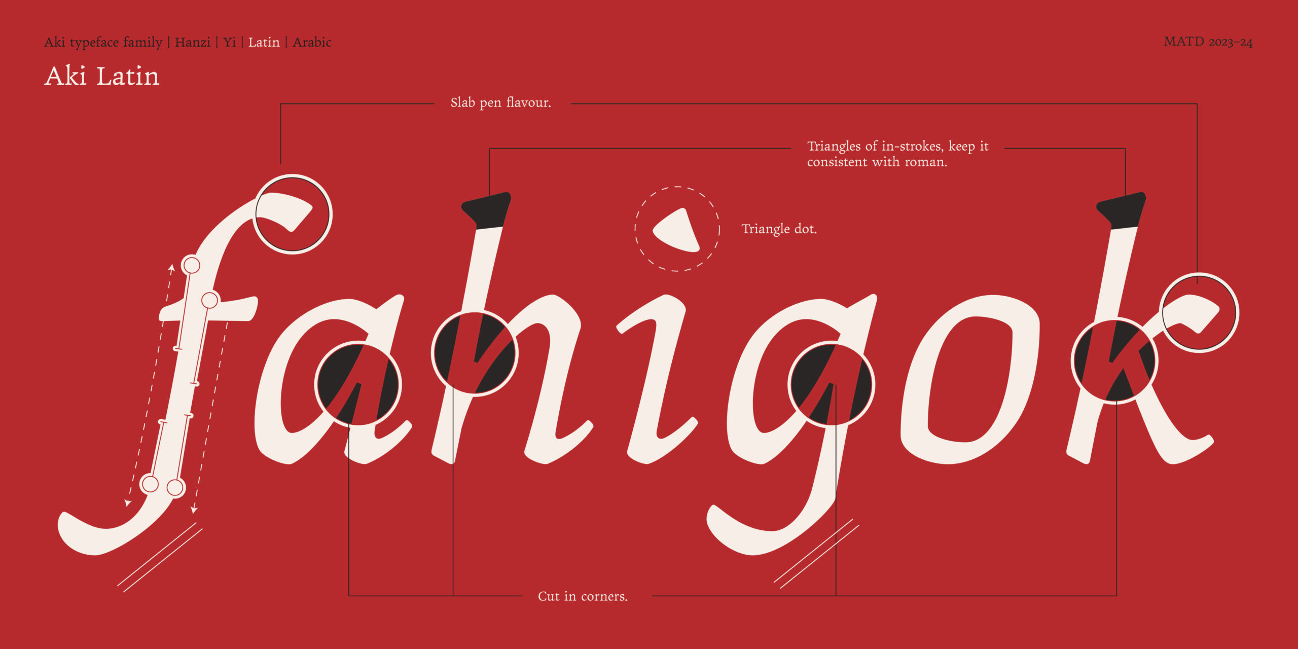
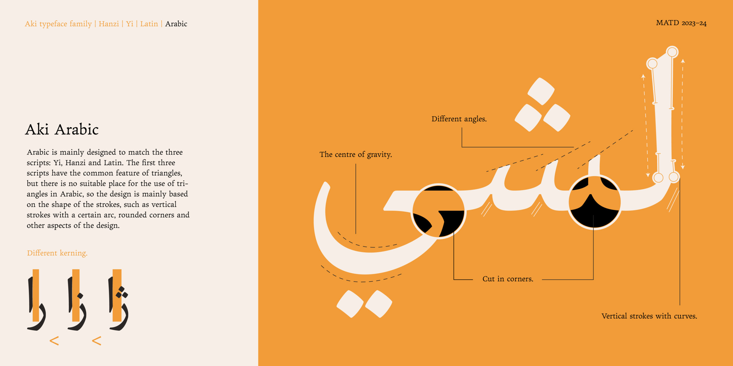
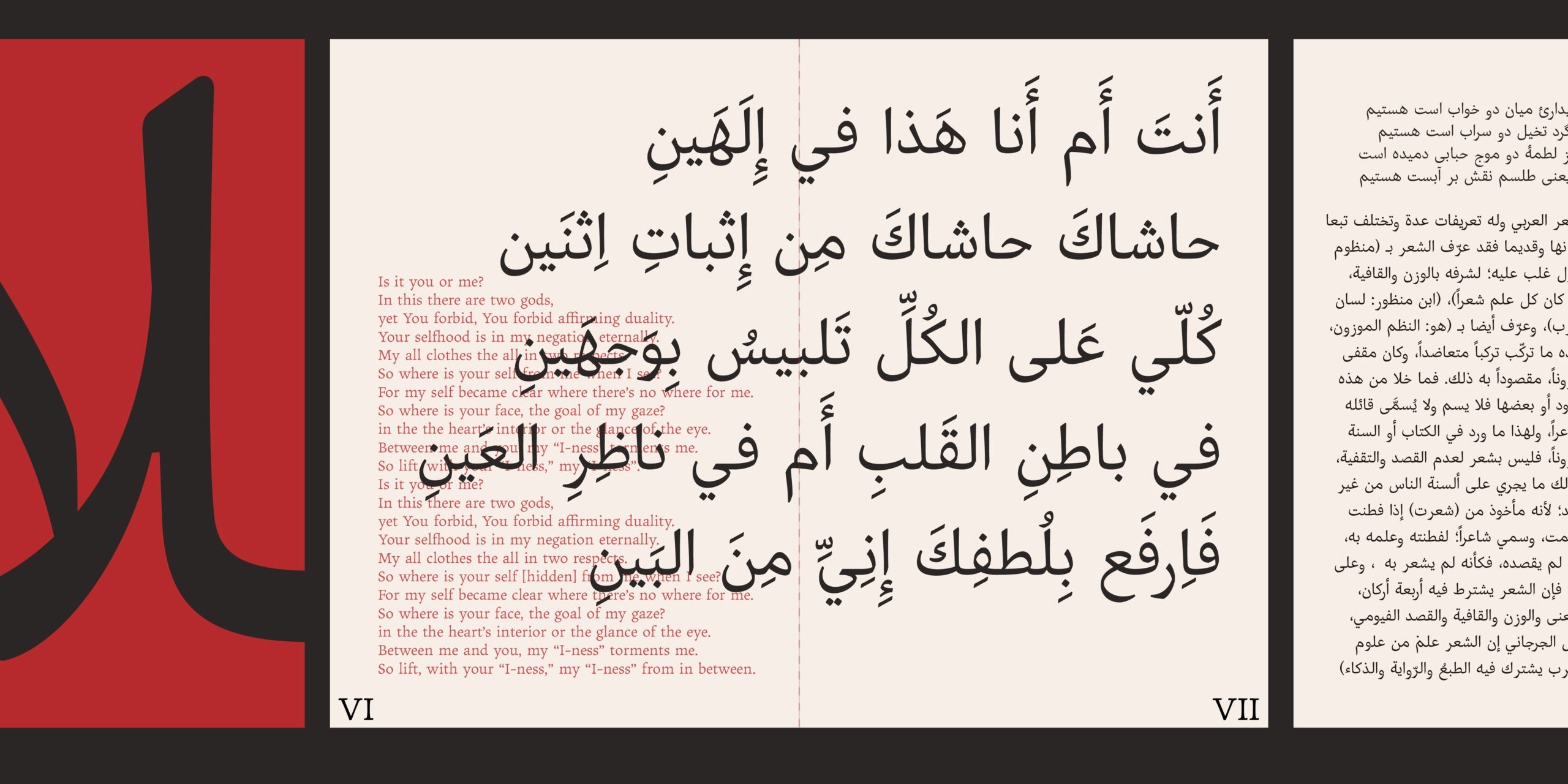
Aki is a multi-script typeface system that gives equal standing to all of its family members. Supporting Yi, Hanzi, Latin, Arabic 4 scripts, Aki embraces the diversity of scripts and writing systems while at the same time uniting them as a family. Inspired by Cuan Baozi Tablet (爨宝子碑) (the rubbing of the original tablet is shown in the last section), Aki is a contemporary typeface that does not forget its tradition. Aki creates a welcoming tension on the page by implementing oldstyle features and calligraphic reminiscences such as a humanist axis, modest contrast, and pen-formed terminals. Aki is designed for high-quality short texts for print and screen, and is therefore very careful in dealing with its expressive tendencies. Don’t hesitate to zoom in to see the outstanding quality of details: triangular but softened stroke endings, asymmetric serifs and subtle stroke modulation. Aki is ready to light up your pages.

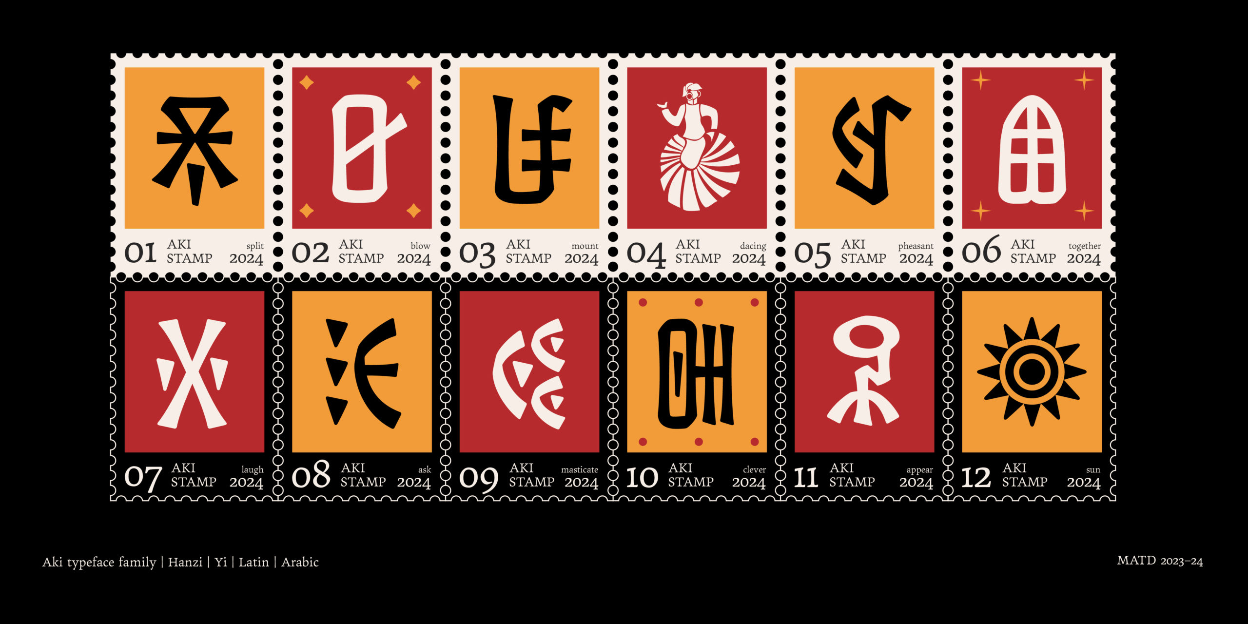
Origin of the name Aki
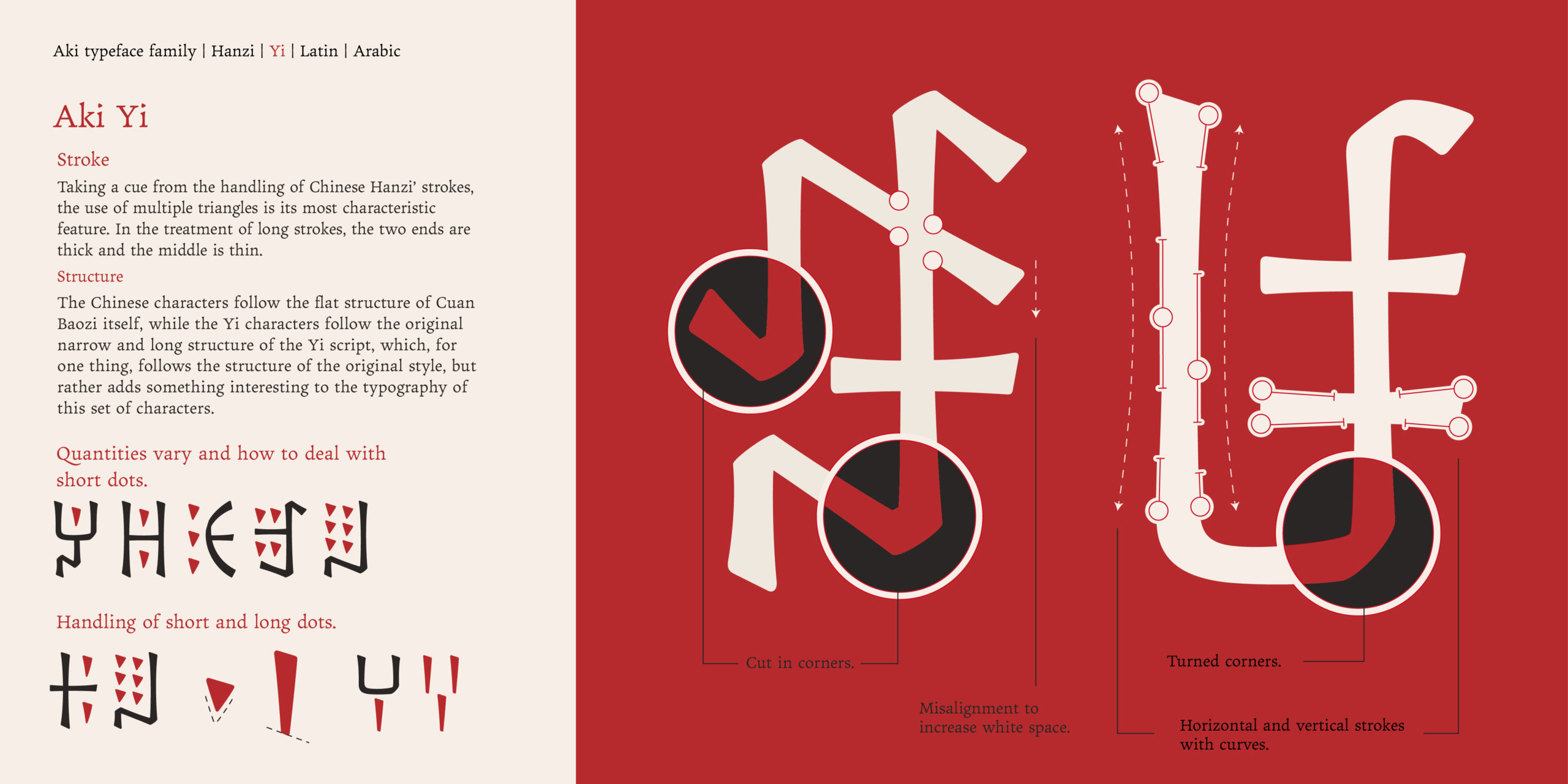
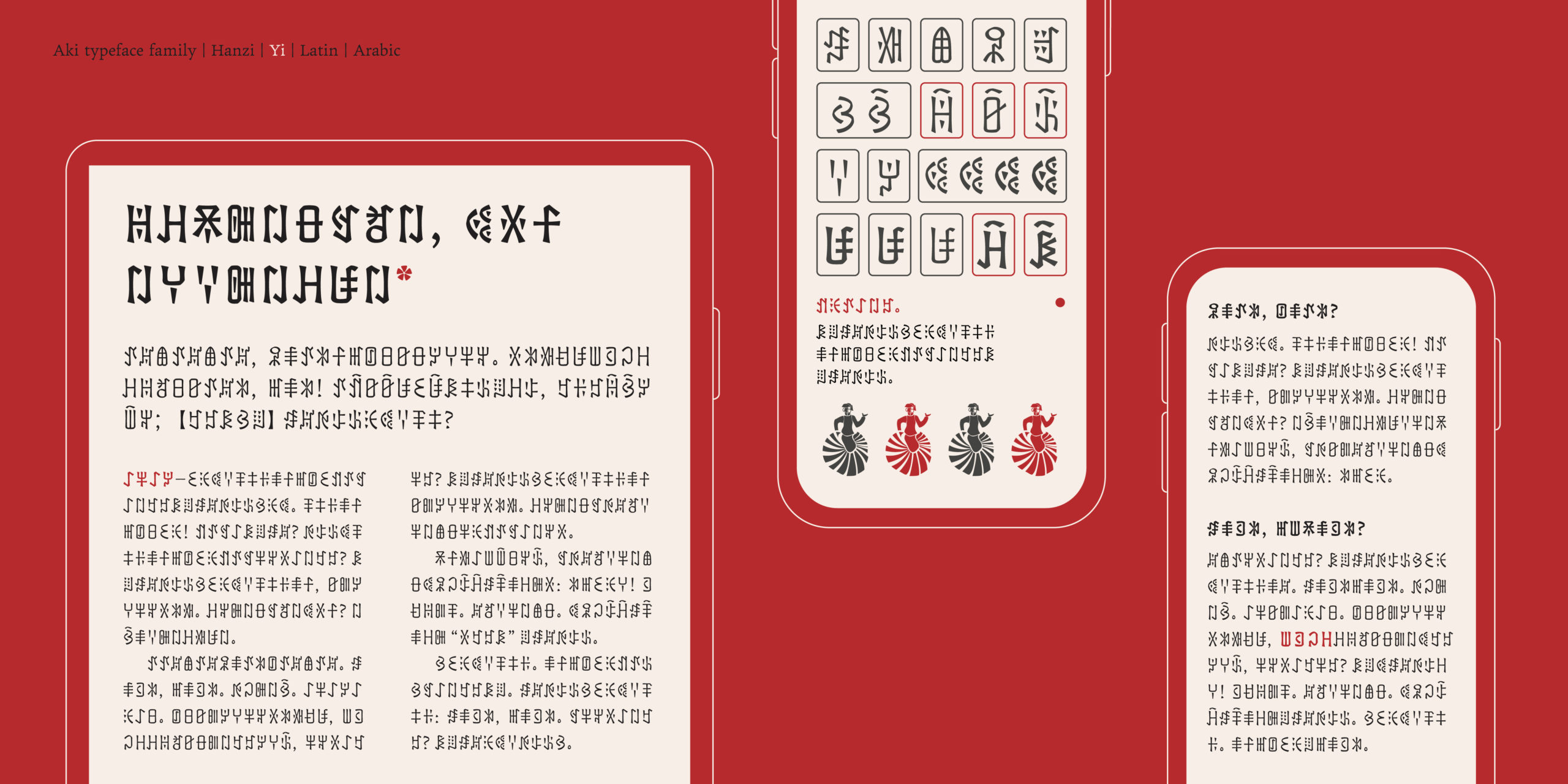
Although the 4 scripts enjoy equal status in the family, it was the desire to make a font on the Yi script that started Aki family. The “Sichuan Yi Standard Programme” is a programme that was only officially approved by the State Council of China in 1980. The Yi script of this project is written in a different direction from the traditional Yi script, so it has a different structure and a different shape. Few people at home and abroad have designed this script. Aki is the legendary creator of the Yi script, and so the name is borrowed here in the hope of opening up a new path for the design of the Yi script.
Inspiration
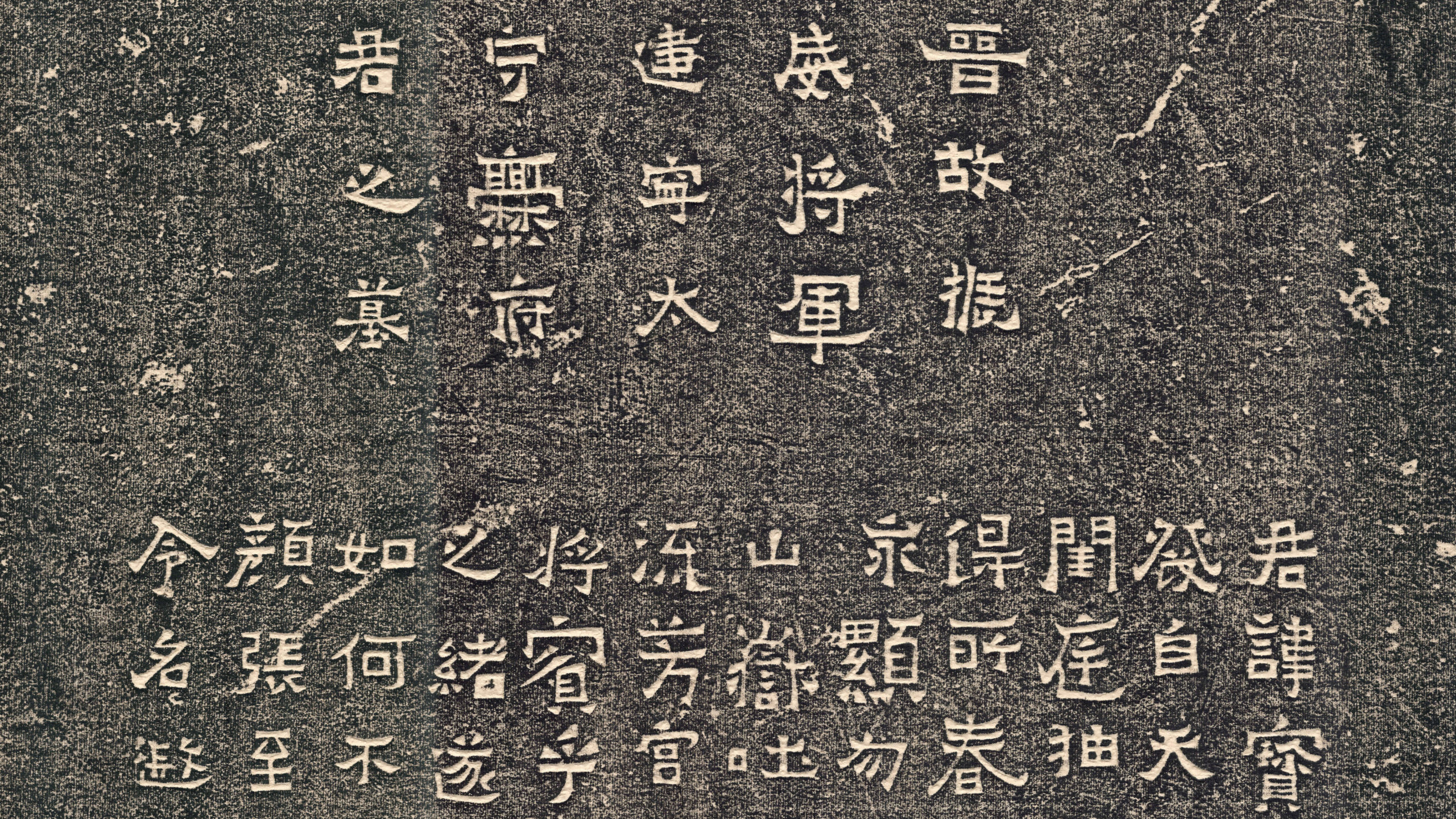
“Cuan Baozi Tablet” is known as “Jin Gu Zhenwei General Jianning governor Cuan Fujun tombstone (晋故振威将军建宁太守爨府君墓碑).” The Cuan Baozi Tablet was not written by a famous person, and does not pay attention to what the brushwork, with the knife flavor, stone flavour, folk flavour, and the Southern Dynasty orthodox celebrity scribes strictly abide by the law, the structure of the brushwork, the scrolls of the atmosphere in strong contrast.
In the Cuan Baozi Tablet, special emphasis is placed on the triangular dots and horizontal strokes at both ends of the “wild goose tail” of the square and strong, revealing the sharpness of the outside, flaunting its spirit, between the Regular Script and the Clerical Script, maintaining a strong meaning of the Clerical Script square strokes. Another characteristic of the brush technique is that it tends to be a “convergence” character, and rarely appears “vertical” strokes, even if a little vertical strokes, it is only a gesture, and it still gives a sense of solidity, simplicity, childishness, and obstinacy by convergence of the closing strokes.
In the past, the Cuan Clan ruled China South Central for 400 years, later called the “Cuan People,” and among the inhabitants ruled by the Cuan Clan, the Yi people were the main ethnic group, and the Yi script was also called “Cuan Wen (Cuan script).” Cuan Baozi monument did not leave the name of the writer, but it appeared in the Yi region, and the writing style and the writing style of the Chinese characters in the past is very different, it is very likely that the Cuan people engraved, or at least the old Yi district people wrote. Therefore, its style has some of the rigour and pragmatism of the Yi people, but also has the temperament of the nomadic people’s exuberance. This connection makes me think that the design of Yi script can start from Cuan Baozi Tablet, analyse the strokes of Chinese characters, and then borrow them to the design of Yi script.
