Varta | Misha Soni
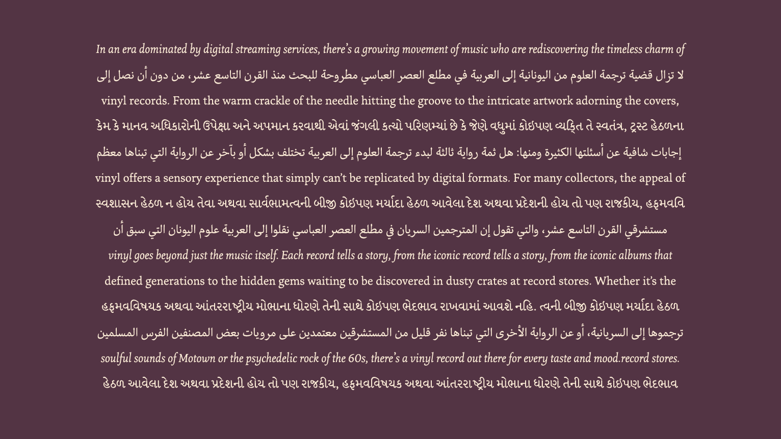
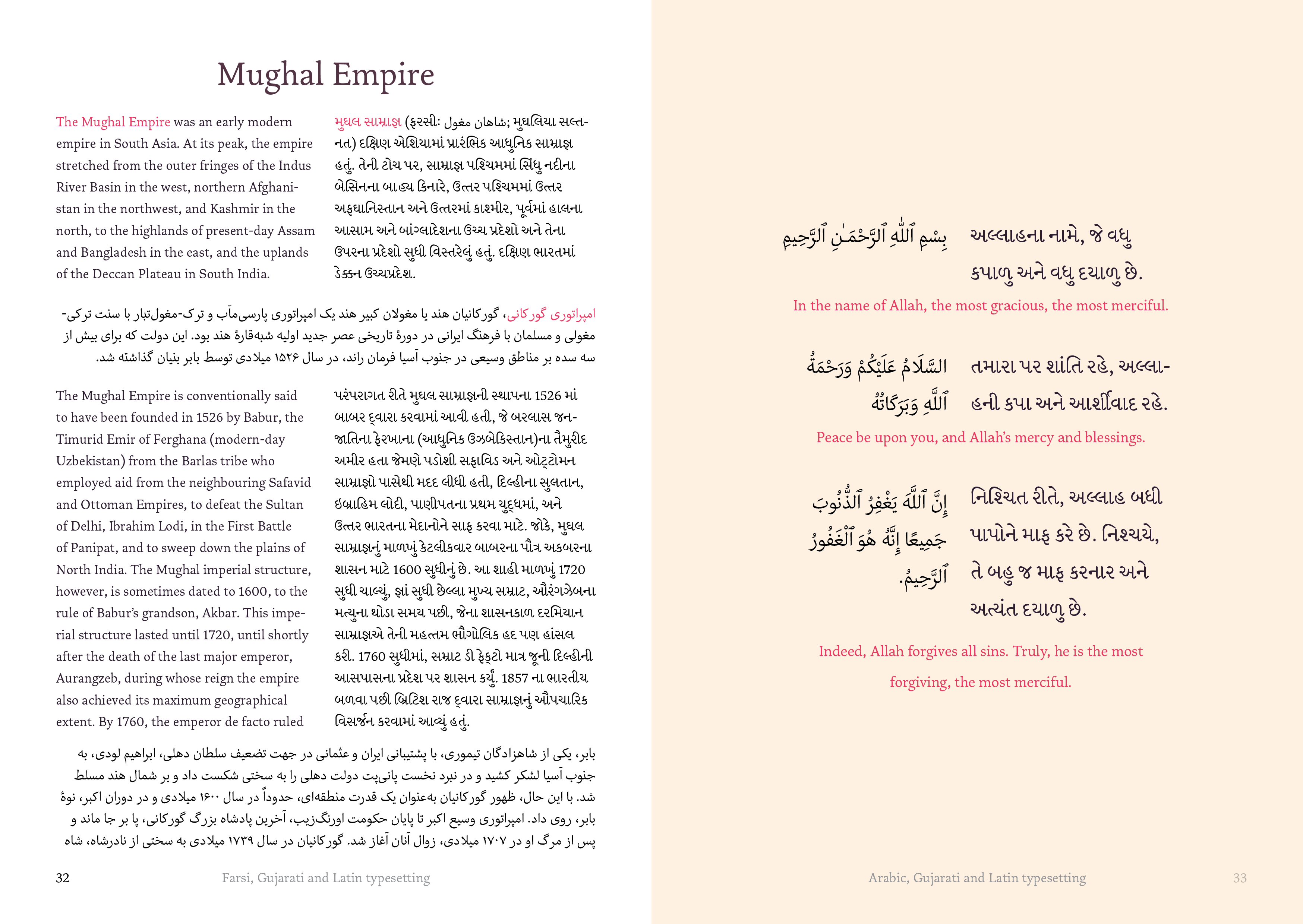
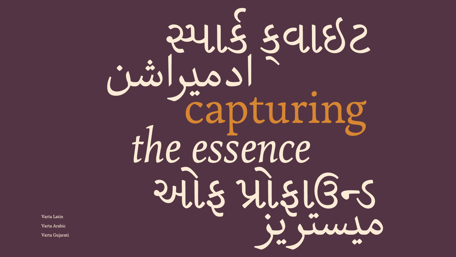
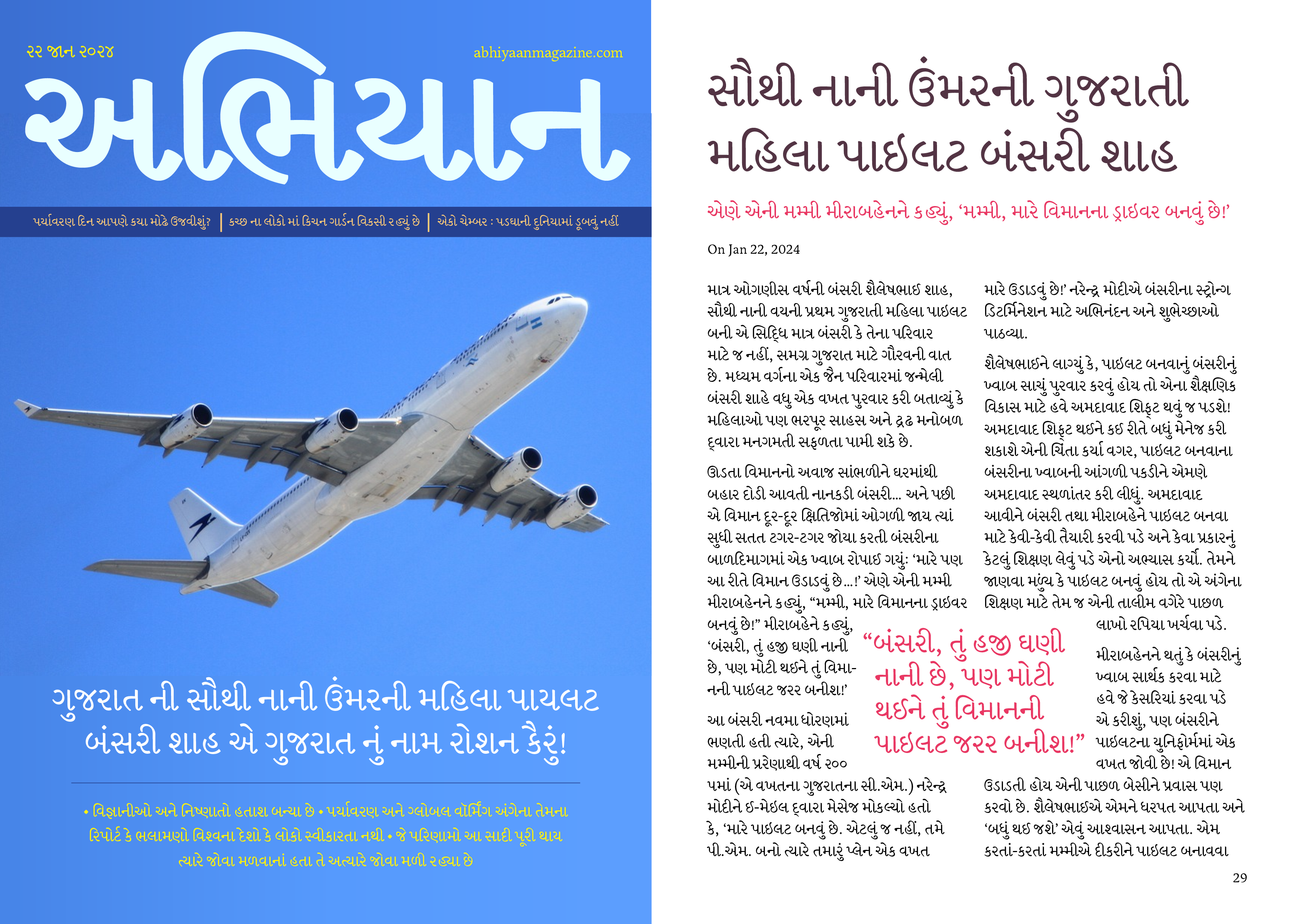
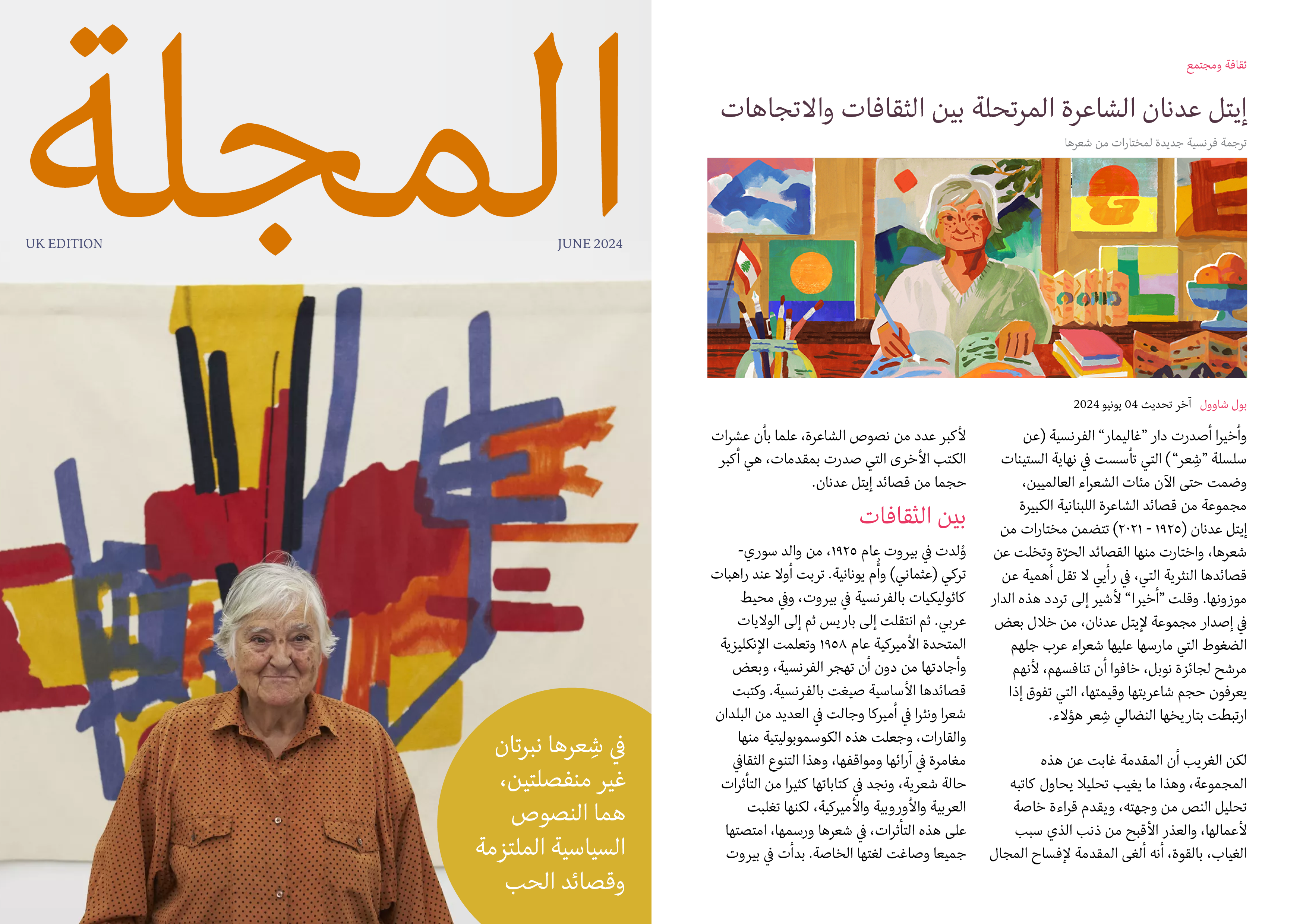
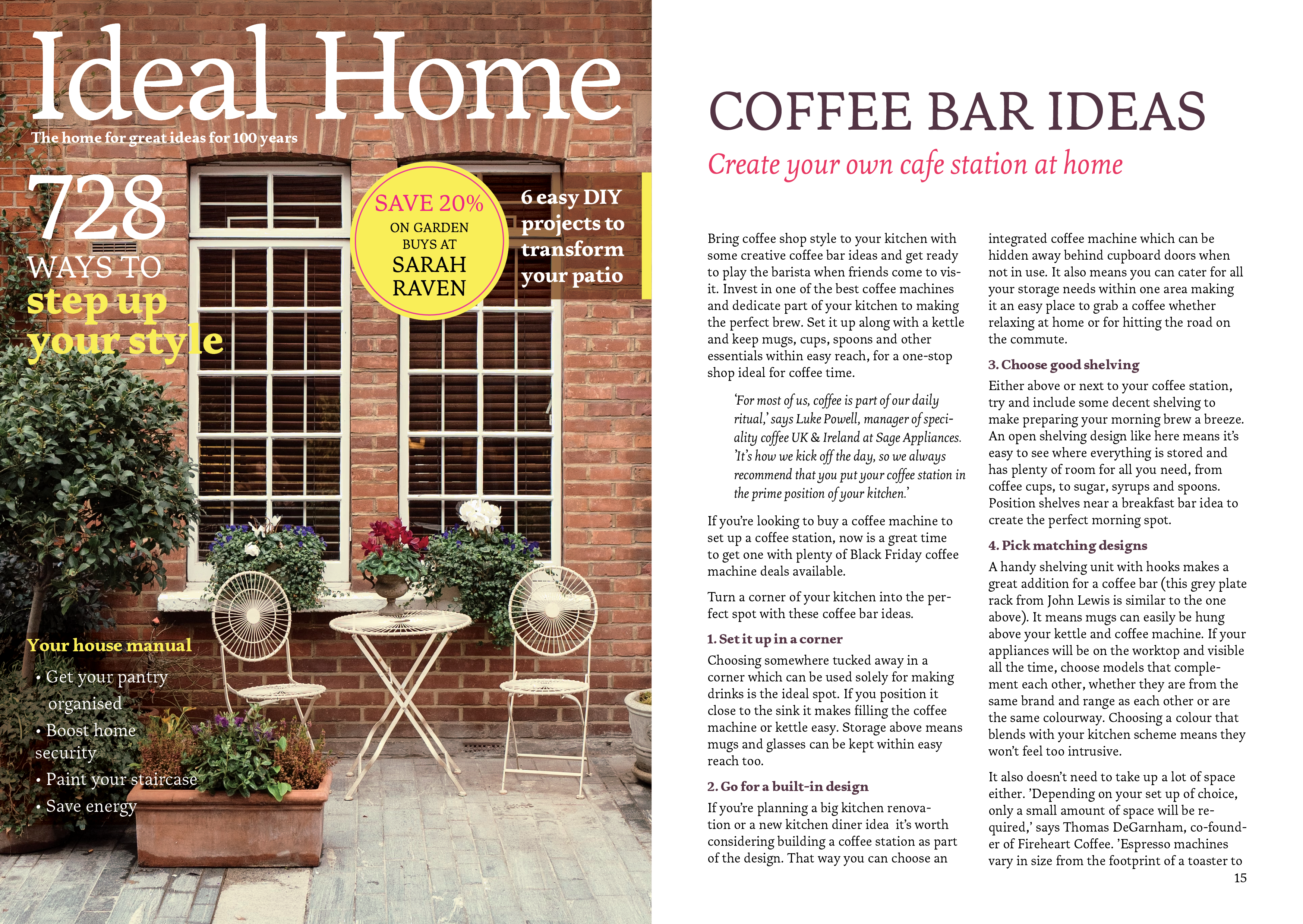
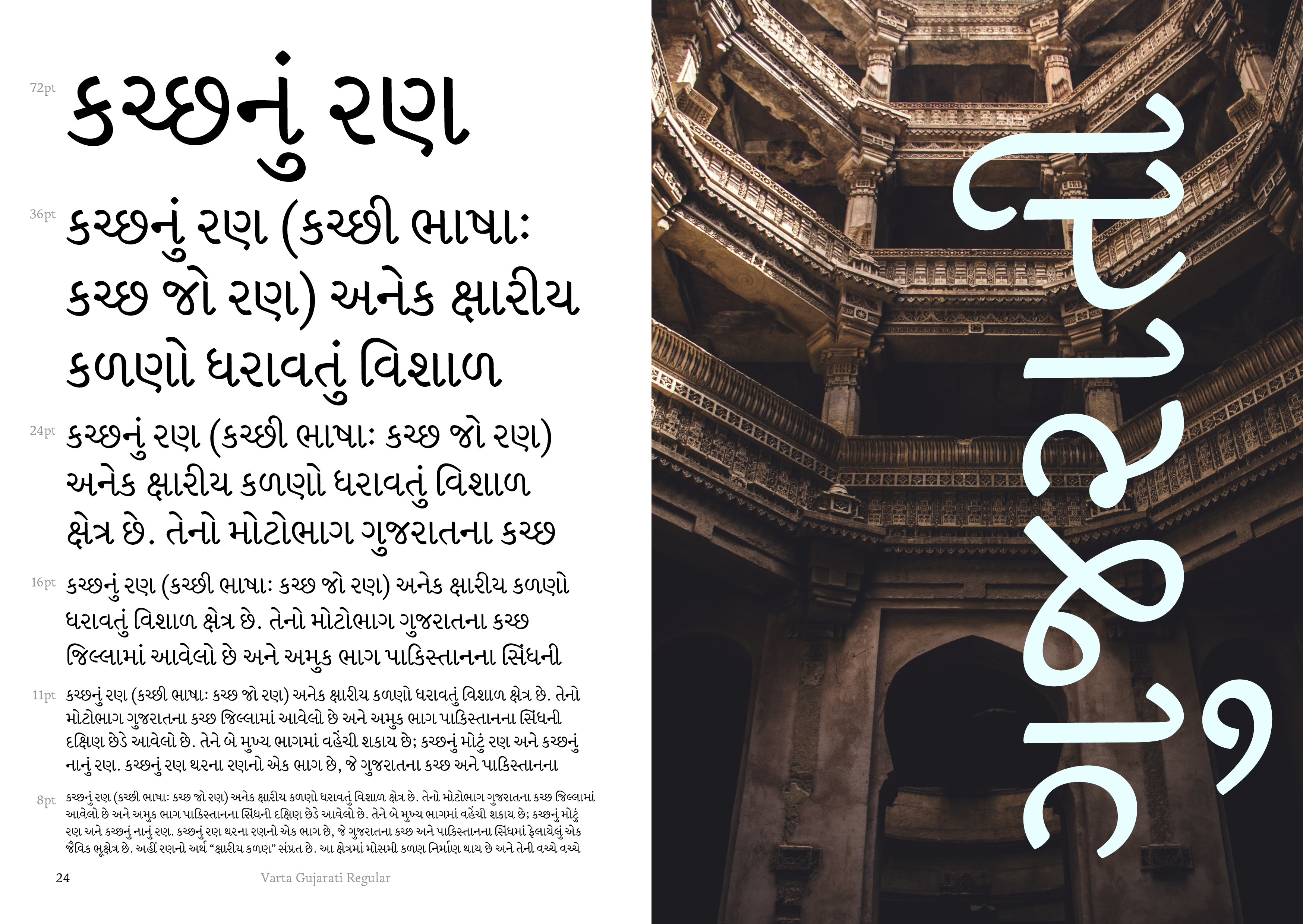
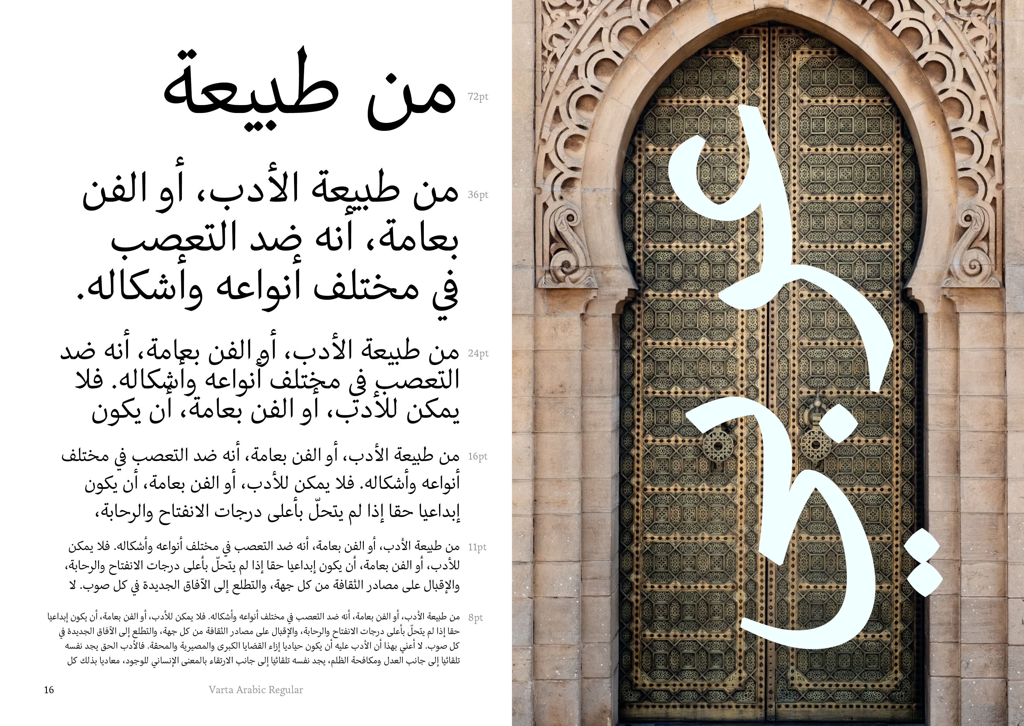
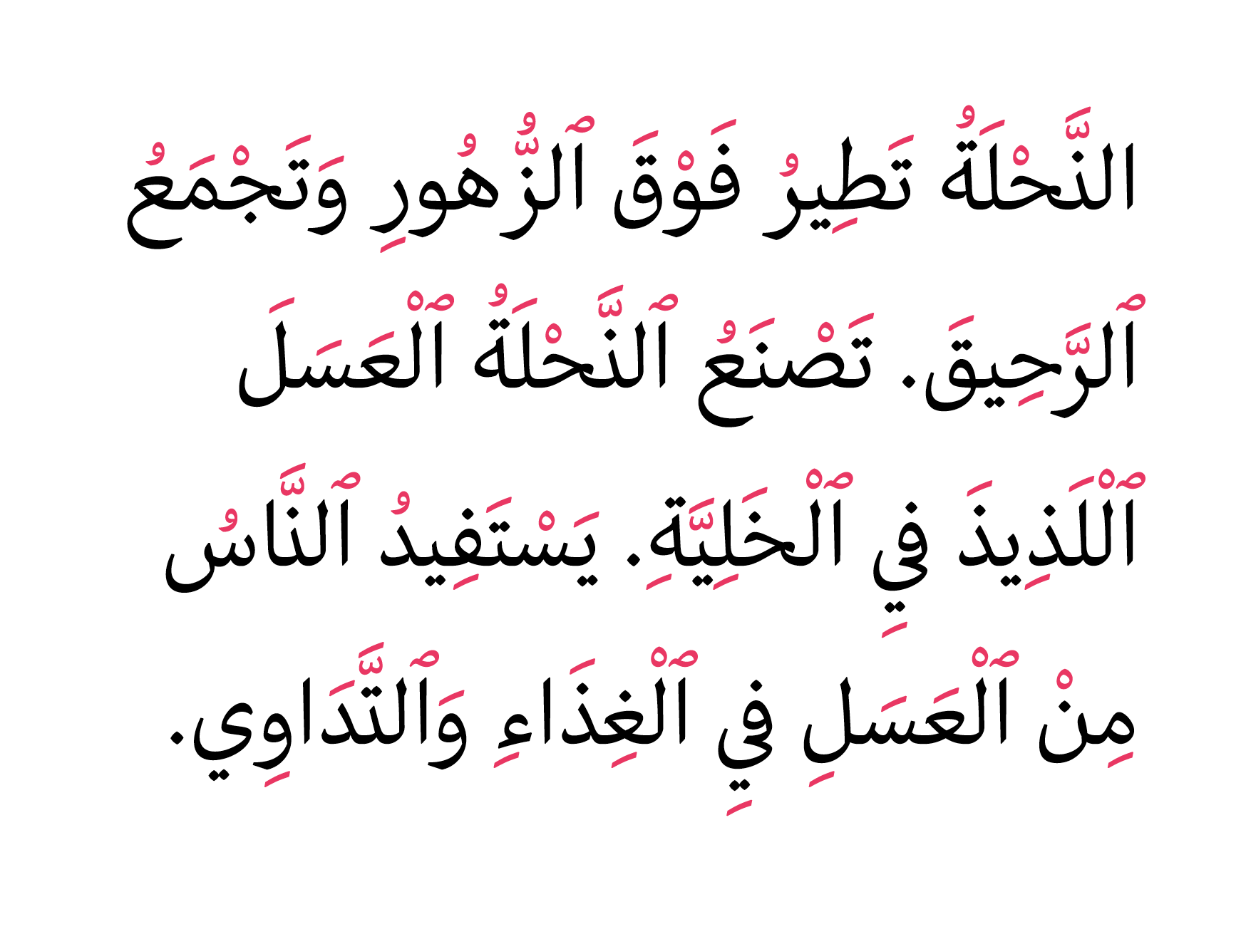
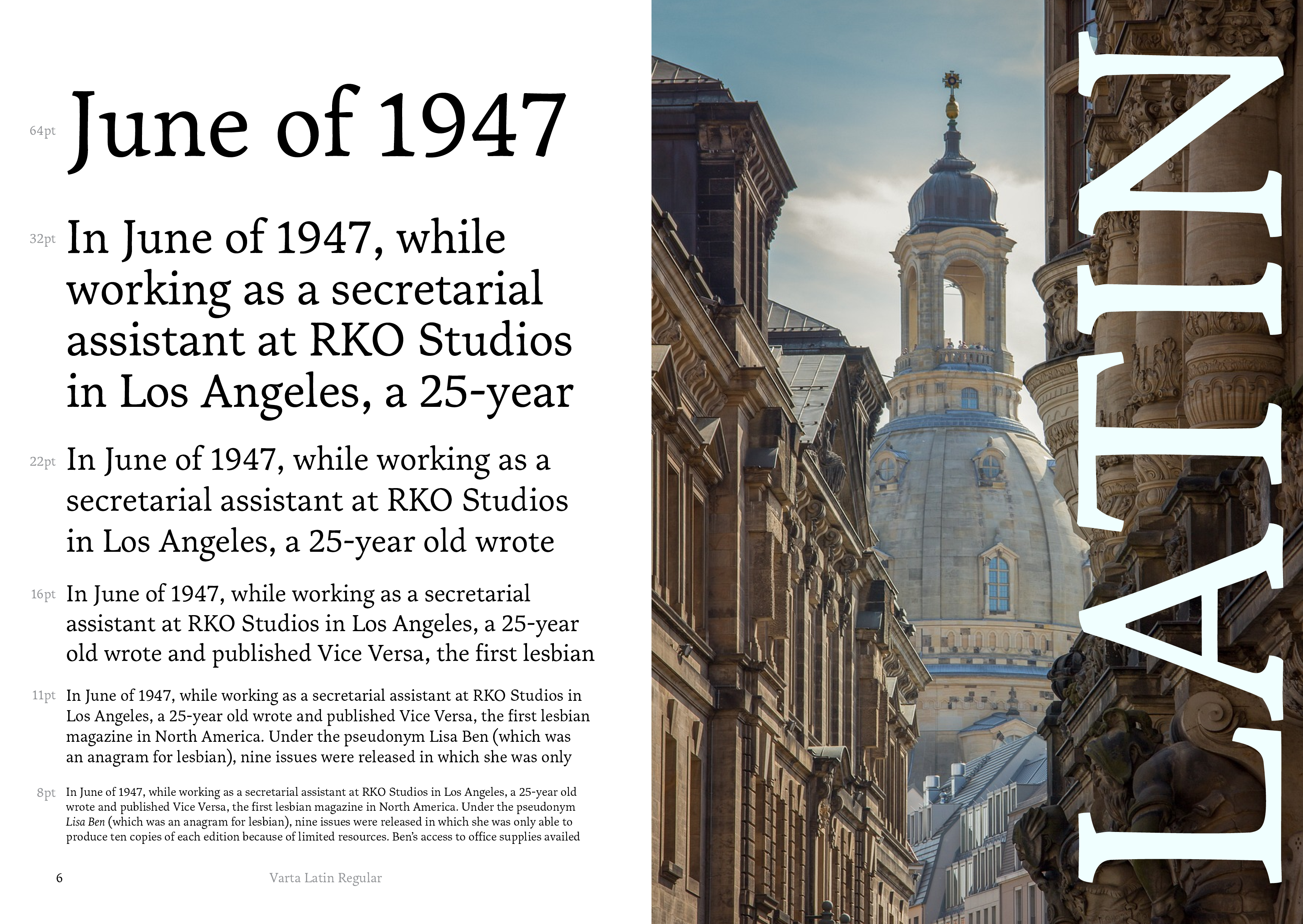
Varta is a low-contrast serif typeface meticulously designed for effortless reading in both print and digital formats. Characterised by its angular details and robust serifs, Varta features engineered ink traps that ensure faithful reproduction in print. The typeface’s open counters enhance legibility, making it particularly suitable for small text sizes. This versatile multi-script typeface is available in Latin, Gujarati, and Arabic scripts, making it an excellent choice for magazines and other densely formatted publications.
Features
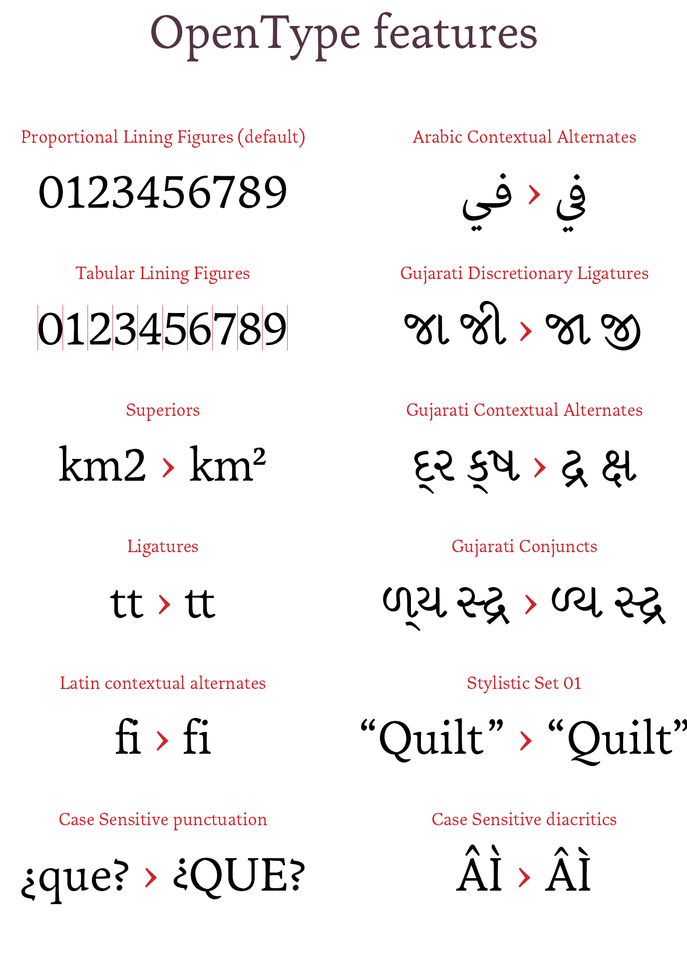
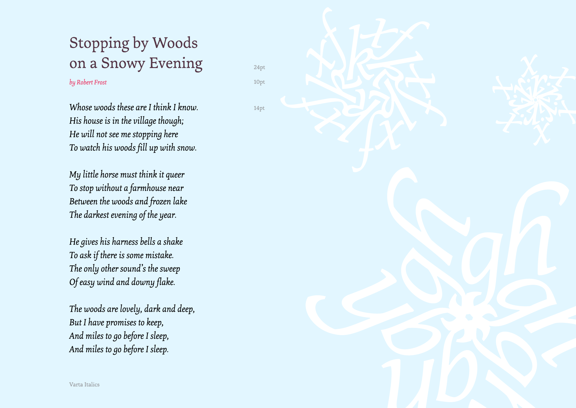
Varta includes stylistic and contextual alternatives to enhance the reading experience across scripts. For example, Gujarati and Arabic scripts incorporate conjuncts crucial for legibility, while Latin offers contextual alternatives for specific combinations like “f” to prevent clashes. Language support extends to Polish, Spanish, Turkish, Arabic, Persian, and Gujarati, among others. Initially, Latin is available in two weights (Regular and Black), while Gujarati offers Regular and Bold, with Arabic available in Regular only. Future expansions will add more weights, as well as condensed and expanded styles.
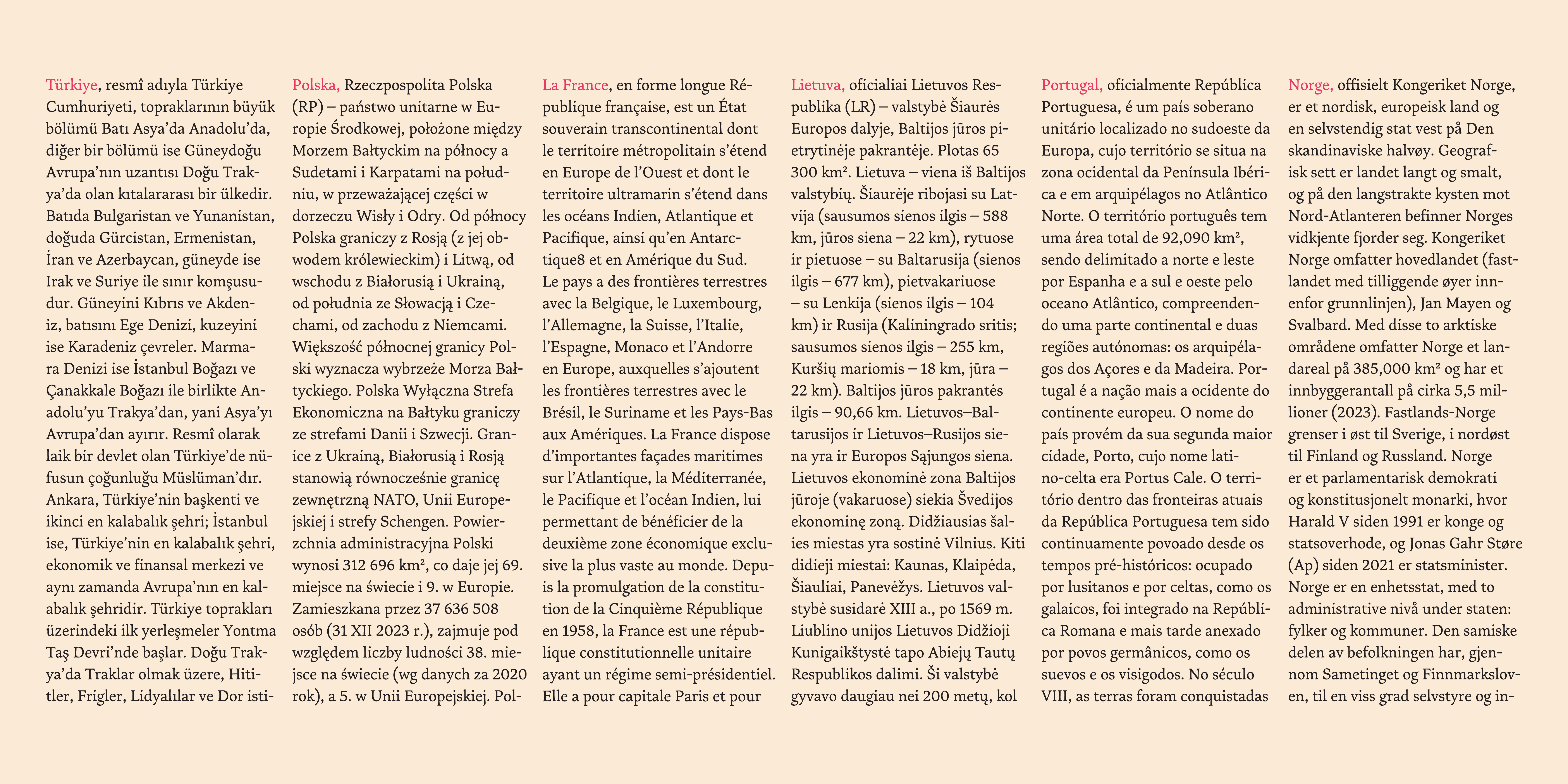
Varta is intended for magazines, books, newspapers, and other text-heavy media, with a particular focus on humanistic fields such as arts, culture, and literature. The family addresses gaps in the market, particularly for Gujarati text typefaces, and provides a distinctive visual identity for Arabic script with its joining loops, which lend a unique character to periodicals and other publications.
Varta’s design process
The inception of Varta arose from a specific brief to create a typeface for magazines, prompted by the evident scarcity of diverse and high-quality Gujarati typefaces that remain true to historical forms while ensuring consistency across letterforms. Thus, I chose Gujarati as my foundational script.
To familiarise myself with the letterforms and proportions, I referenced an old Gujarati writing book. This initial exploration led me to examine how existing typefaces have made design decisions to contemporise these letterforms. Notable influences included Skolar Gujarati and Adobe Gujarati, alongside a study of monolinear Gujarati typefaces that present modern interpretations of traditional forms.
Once I achieved a satisfactory standard for the Gujarati script, I embarked on designing the Arabic counterpart, aiming to draw inspiration from Arabic letterforms and vice versa. Recognising the characteristic loops in Gujarati letterforms, I incorporated similar features into some Arabic forms to soften the sharp edges commonly associated with Arabic script. My Arabic design drew inspiration from Adobe Arabic, Nassim, and Sakkal Kitab, focusing on traditional letterforms.
The Latin counterpart emerged as the final yet essential addition to the family. This process proved instrumental in resolving numerous design decisions for both the Gujarati and Arabic scripts, allowing for cohesive integration. Varta Latin was inspired by its Gujarati and Arabic counterparts. Given that Gujarati and Arabic feature predominantly organic shapes while Latin is characterised by straight lines, I endeavoured to infuse more dynamism into the Latin script by minimising straight lines. For Latin proportions, I drew inspiration from popular text-heavy typefaces such as Karmina and Quadraat, as well as Marco for its exceptionally balanced humanist outlines. The process of drawing inspiration from multiple scripts while remaining faithful to each individual writing system yielded unexpected yet gratifying results throughout this learning experience.
Varta represents a culmination of thoughtful design decisions aimed at addressing gaps within typographic offerings across multiple scripts while fostering harmony among them—a testament to both aesthetic appeal and functional readability.
