Roger and Squeak | Radek Łukasiewicz | 2020
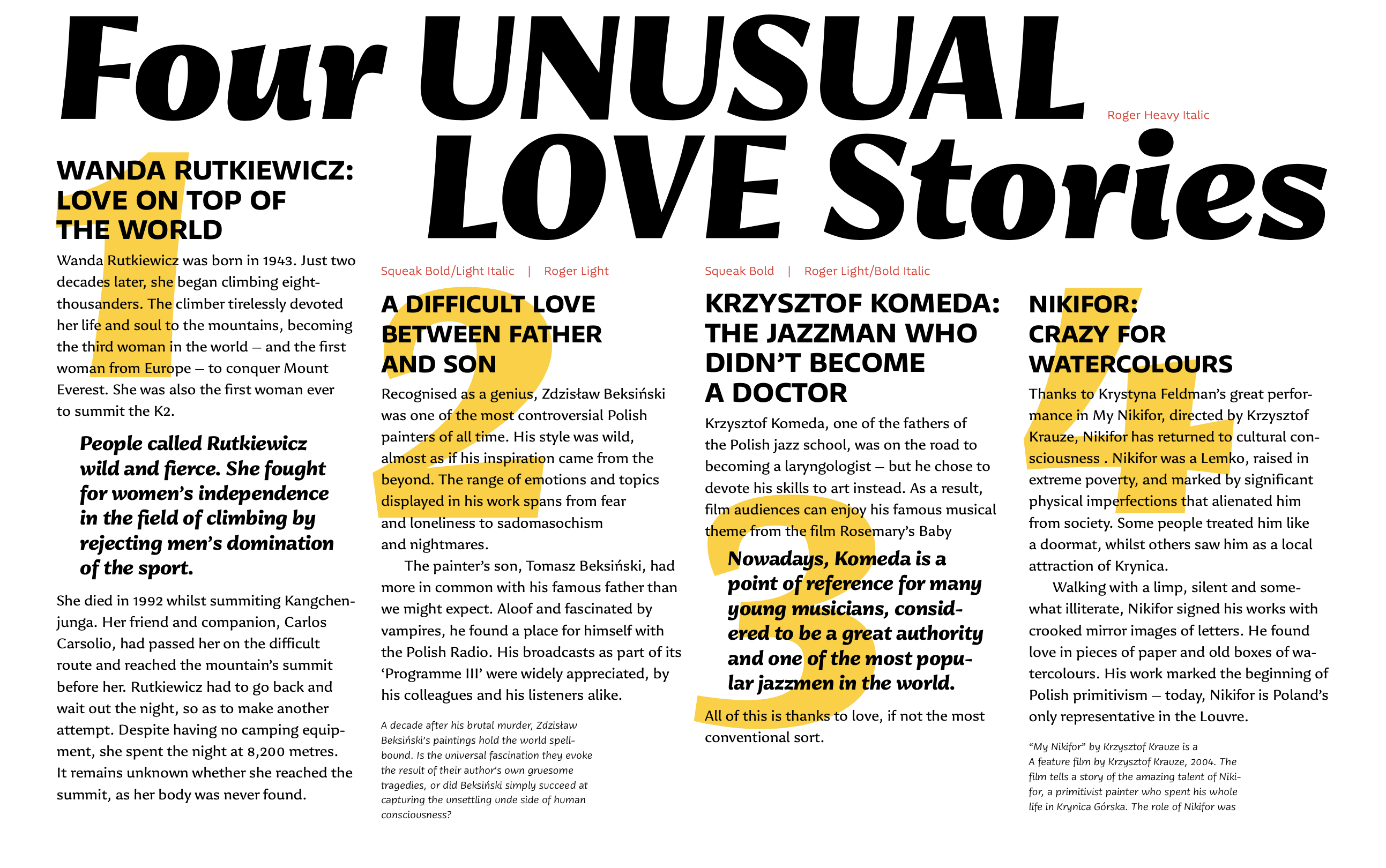
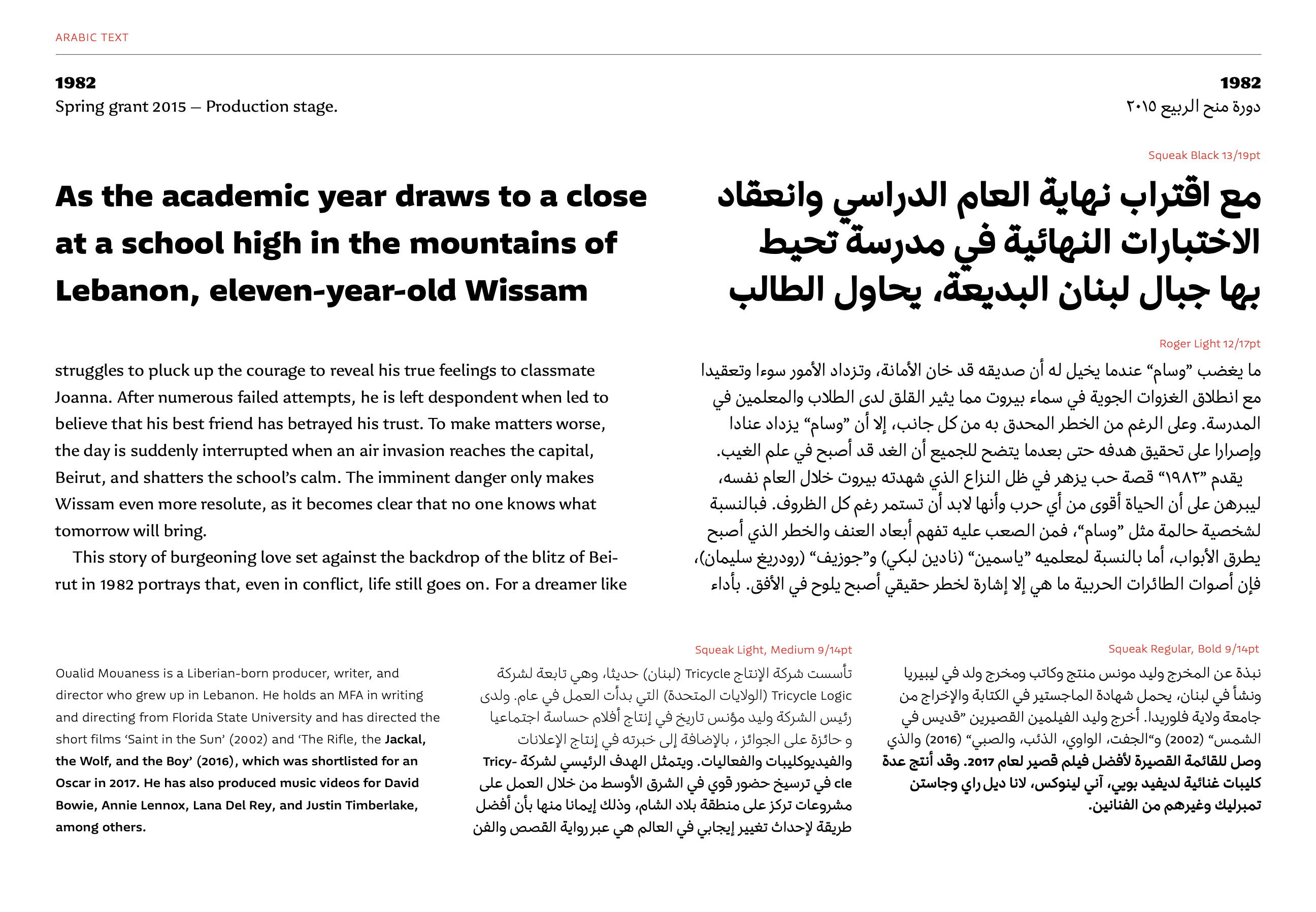
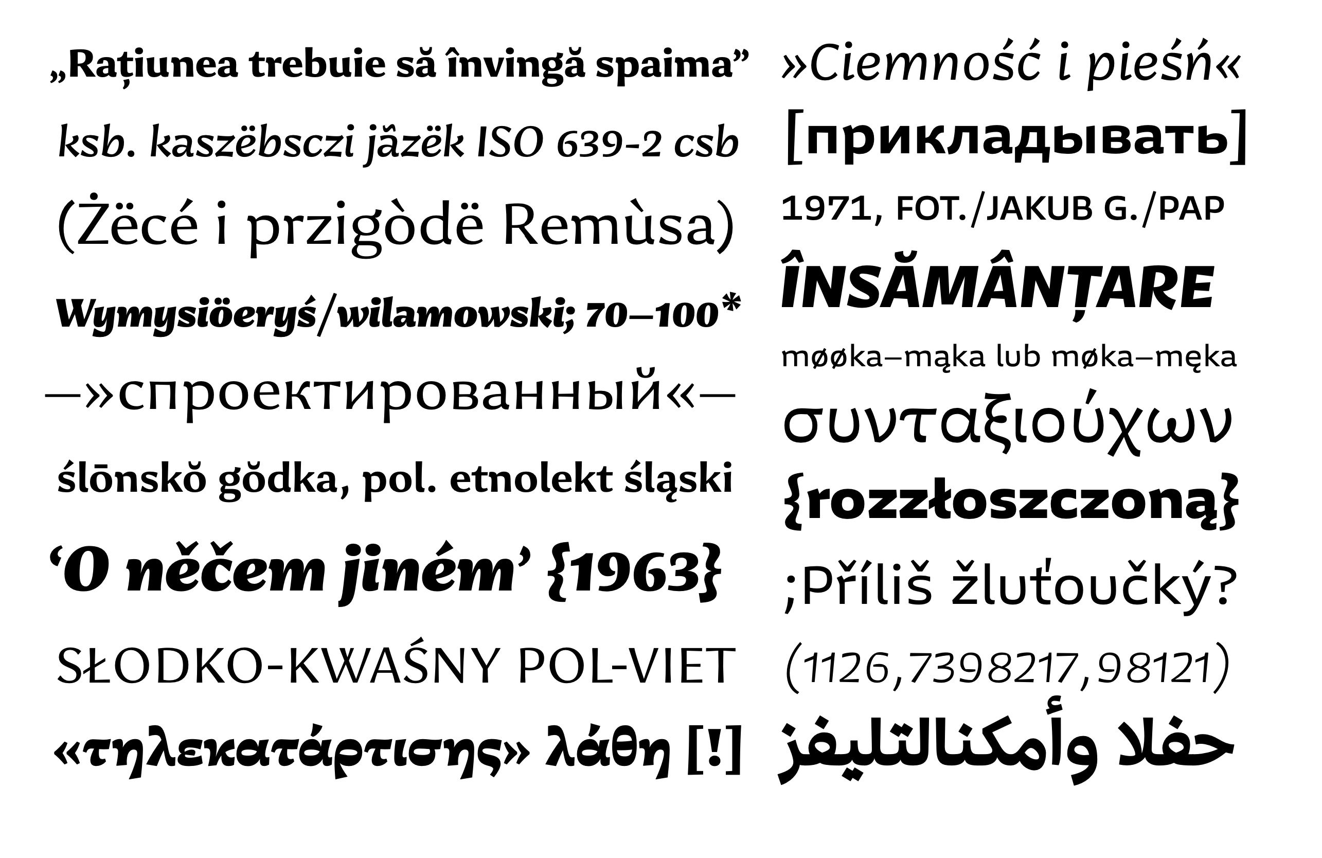
The aim of this project was to design a type system consisting of two distinct families with individual yet complementing voices. This is not a super-family based on the same skeleton, but two typefaces that are equally mindful of the individual characteristics of the different scripts: Arabic, Cyrillic, Greek, and Latin. The project takes inspiration from well-known typeface pairings from web and print environments, and is developed within the context of present-day high-resolution screens.
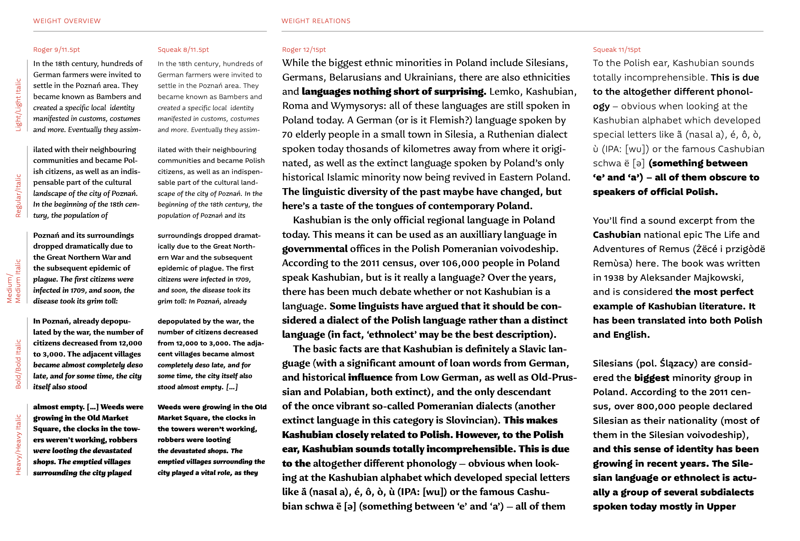
Roger eludes the categorisation of serif or sans, and borrows elements from both models to achieve optimal reading. The letter shapes respond to all four scripts, with the italic (currently only developed for Latin and Cyrillic) providing adequate differentiation, without the pace and proportions being drastically different from the upright. This allows for effortless reading of longer passages of italicised text. Roger performs especially well when used for the mid-length texts, usually read on web platforms.
Squeak is a sans serif typeface, tailored for captions, side notes, and short paragraphs that performs well in small sizes. Squeak Italic follows the same direction, and challenges the prejudice of a secondary sans serif style underperforming in small sizes. With a distinct personality, the italic shows the fun side of the family, yet keeps the features of the upright. Squeak is native in Arabic, Cyrillic, Greek, and Latin for upright styles, and Latin for italics.
The weight range spans from light to heavy, which allows for typographic richness, both for paragraph setting and attention-grabbing titles. Both type families are variable across the weight axis and also cover five static weights with italics.


Roger and Squeak are published by CAST Foundry as Jantar Sharp and Jantar Flow.
Some of Radek’s work is on Typoteka. At ATypI 2020 he shared a presentation with fellow students on “Emerging as a type designer in the online-only environment.”